-
11.
Style Themes
Style Themes define the main background image, the colors of most screen elements and texts, and optionally the logos for your screen.
Every screen hook up to a style theme. If no custom style theme has been created your screens will link to the default style theme.
The default style theme is named with your customer name and postfixed "default styles". This theme is non-deletable and works as the fallback theme if a screen links to a deleted custom theme.
-
11.1
The Style Theme Properties
Every style theme can be edited to your taste. Best practise is to have the most part of your screens linked up to the default theme, so that most screens appearances can be edited in one time and because screens may fallback to this.
Let's go through the properties of a style theme.
-
11.1.1
Style theme name
This is the theme's identifier. Useful names could be "[some branch]s theme", "The Chrismas theme", "Children's section theme".
-
11.1.2
Background
Background image (upload):
This is the main background used on screens linked to the style theme. If no image is uploaded the screen will use a simple default texture. Don't worry about the contrasts of your image. This can be smoothed out by color settings below.
Background image size:
Cover : resizes your background image just enough to fill out the screen, so no borders are shown, no matter the screens format.
Original (repeat) : use the image's original size and repeats it when necesary. This is great for using smaller repeating patterns.
For best results, when using "cover", the uploaded background size should be the same as the screens resolution. In most cases 1920 x 1080 pixels for horizontal screens, and 1080 x 1920 pixels for vertical screens.
Background colorize:
These controls lets you choose a color tone and set its intensity on your background image.
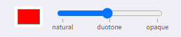
The intensity slider has two stages:
The first goes from natural (no color) to a full duotone overlay in the middle. The duotone effect changes the contrasts of your image to a gradient span between (almost)black and the chosen color.
The second stage incremently draws the dark color of the duotone closer to the chosen color, making it fully opaque at the end as the two colors become the same.
Use the colorizer to create a stylish effect to your background or to make any background texts stand out better.
To create a background with nothing but one color, pull the slider all the way to opaque
Text color on background
Both +active and +dsiplay screens has texts placed directly on the background. Use this to select a color that stand out from your background design.
-
11.1.3
Element / Button colors
Upon the background we have graphical elements and buttons on +display/idle and +activ screens respectively. Theese elements are usually styled by two colors and sometimes of three.
Element color
The default element/button color. A color that stands out from the background would be a good choice.
Element text color
The text color of the default button. Choose a color that has good contrast against the element color.
Element secondary text color
Used for additional text inside a button (usually the menu button on +activ screens). Also it makes another option for element color inversions (see below).
Color variants (invertions)
The colors here define the 'default' button/element color variant, which means you in some places have the options to invert the colors. For example in the article view of the +active screens (read more below). Also you can set the variant (inversion) of elements/buttons under the 'styling' tab for each presentation and widget.
-
11.1.4
Presentation image overlays
Sometimes texts are placed over presentation images. E.g. in calendars. Use theese color controls to make the text as readable as possible and even give the presentation images a stylish look.
Image overlay colorize
Works like the background colorize control. Choose a color tone and set the intensity of it. The intensity slider goes from no color, through a stylish duotone, and into a fully opaque color.
Text color (over image)
Choose the color of the texts placed over the images. This should be in a good contrast to the chosen images overlay color.
-
11.1.5
+display and +idle specific
Reduce background texture
If your background image has a lot of texture or contrasts, it may impair the readability of the article body text on +idle/+display screens. This control adds an extra color overlay on the background - in the same* color of your chosen background colorize. *The color is alted a little compared to the chosen background text color. A lighter text will result in a bit darker background overlay, and the other way around, to make the article text even more readable.
Touch Advice Background
Choose a colors for the background of your +idle screen's touch advice. One way could be to let it stand out from the rest of the screens colors. Another way is to let it blend in with you chosen styles. It's up to you.
Note: the content of the touch advice (text and icon) is always white. -
11.1.6
+activ article and keyboard colors
Article paper color
This set the so called paper color (text background) of the article module on +activ screens.
Article text color
The text color of the +activ article screens
Note: Paper and text color are also applied to the article list view when a choices of multiple articles are given.
Article button variation
This set the button colors variation of the of the buttons in the article module such as 'send to mail' and other. The colors themselves are set in the element/button colors above. This dropdown only selects which inversion of the colors you want for the particular buttons. The chosen color variation also applies to any on screen keyboard.
Default: The default colors as set
Inverted: Text color becomes element color and element color becomes text color
Inverted-secondary : Secondary text color becomes element color, and element color becomes text color
-
11.1.1
-
11.2
Add a new Style Theme to a screen
To create a new Style Theme:
- Select Style Themes from the options on the Main screen.

- Select + Add Style Theme to create a new style theme from scratch, or start with another Style Theme's style by clicking the copy button:

- Edit the Style Theme to match your desired design. In the Style Theme editor you can directly see your changes in the previewer field.
Read more about the different settings above in the section The Style Theme Properties - When you have made the desired configurations, select Save
- Select Style Themes from the options on the Main screen.
-
11.3
Presentation & Widget specific styles
You're able to change the design of each presentation and widget by overriding the style theme design choices you've made.
You do this in the Styling tab for the presenation or widget you wish to customize.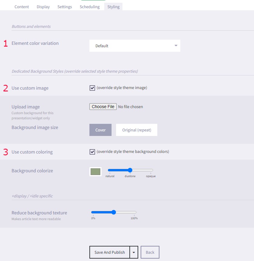
It's possible to override the following style theme design settings:- Element color variation changes the way colors are displayed for buttons and elements.
- Custom image gives you the option to change the background image for the presentation or widget you're editing.
- Custom coloring gives the option to edit the Background colorize and Reduce background texture.
When you've made your Styling changes, remember to click Save
-
11.1