Manual index
-
1.
Product Overview
+activ, +display, +idle and +embed are part of bibliotheca's uniFi+ suite, designed to allow libraries to create and display engaging and informative articles and images on screens around the library.
- uniFi+activ - The +activ is interactive and provides displays that patrons can engage with by touching the screen to view specific articles or take part in quizzes or polls. It is designed to allow individuals or small groups to learn about specific subjects in a fun, interactive way. In order to offer interactivity, the monitor must have touch screen capabilities. +activ
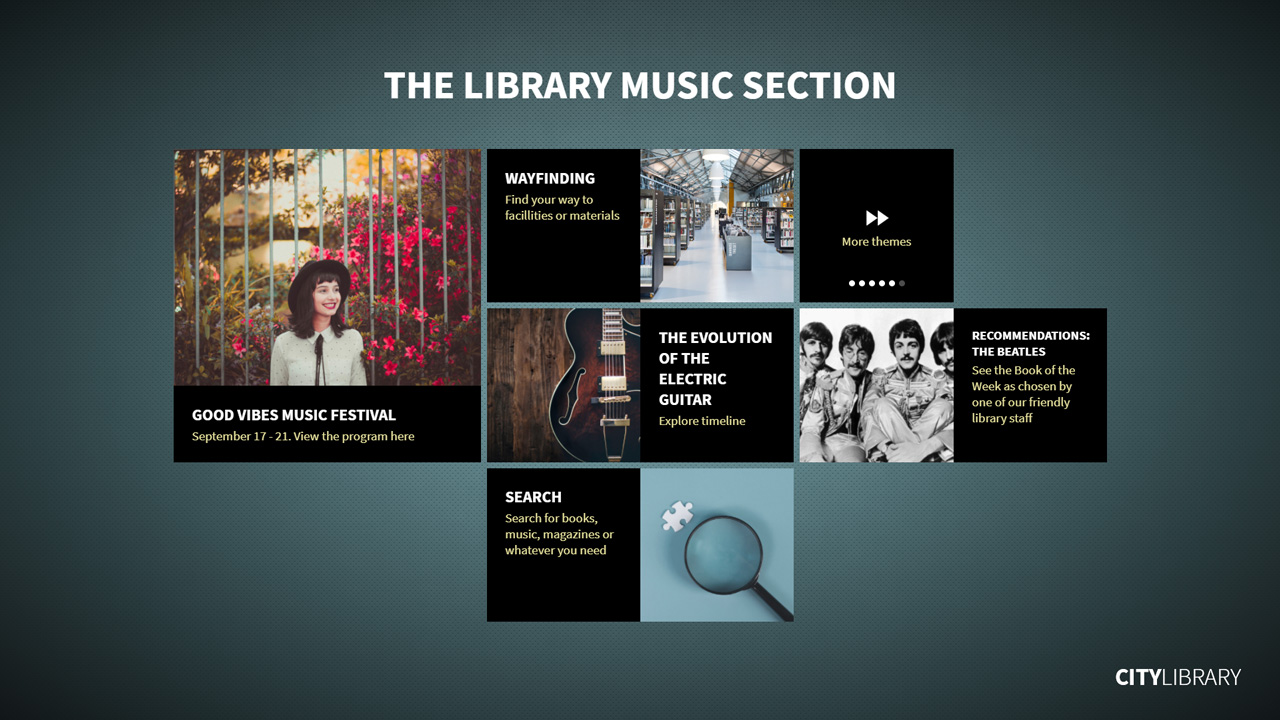
- uniFi+display - The +display is not interactive and is used to display news and information that you want all patrons to see, and can be displayed on any modern TV or computer screen.
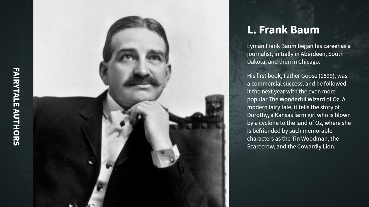
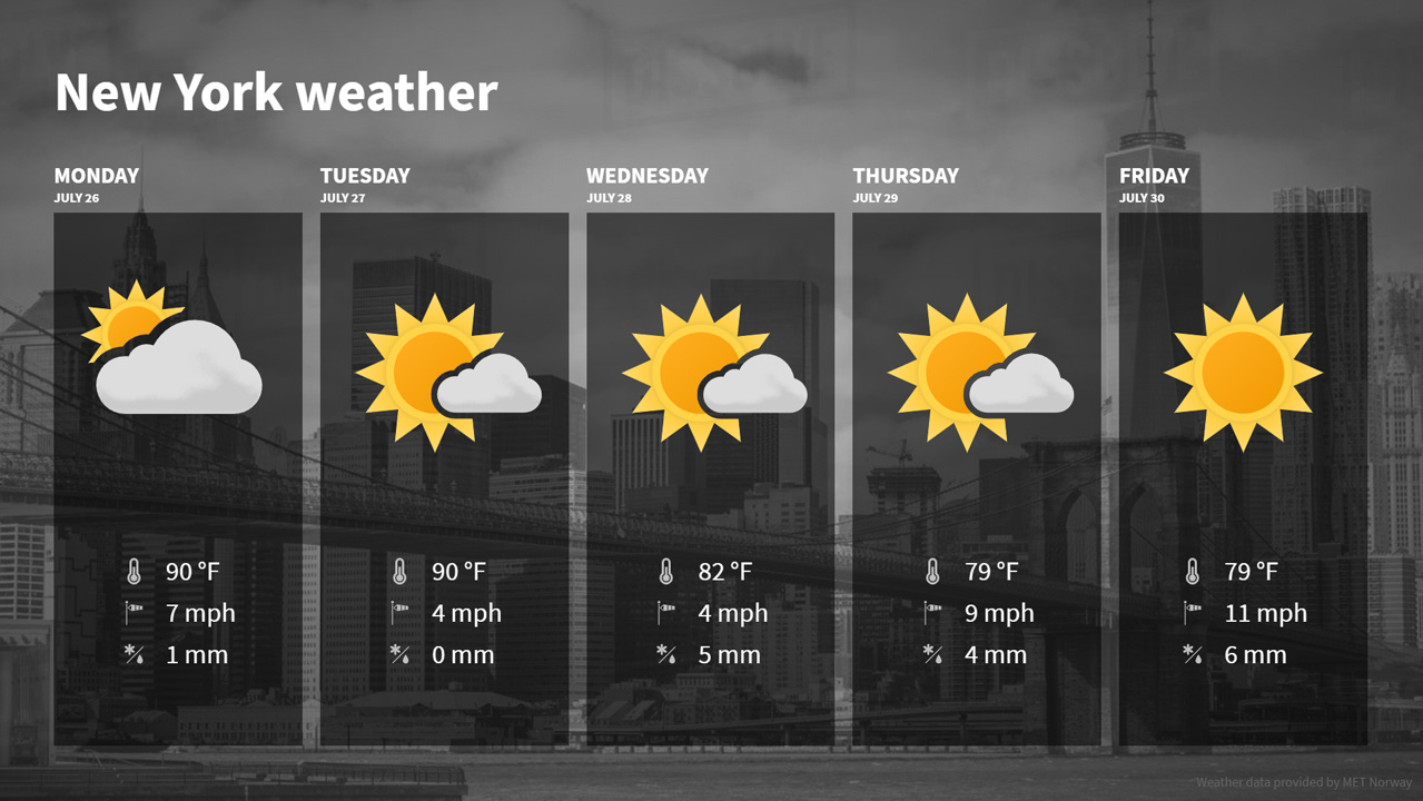
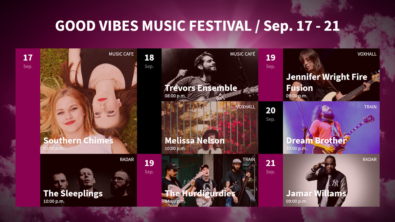
- uniFi+idle - You can set the self-service kiosks and public PCs in your library to act as mini +displays whenever they have been idle for some time. The kiosk or PC will automatically download articles from the uniFi+ Administration module and display them the next day as a screensaver when the kiosk or PC is not in use, where the kiosk or PC is restarted daily.
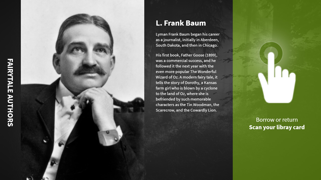
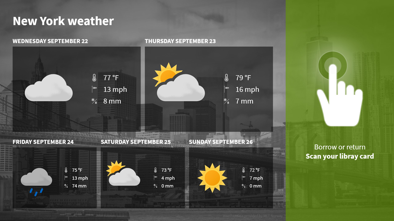
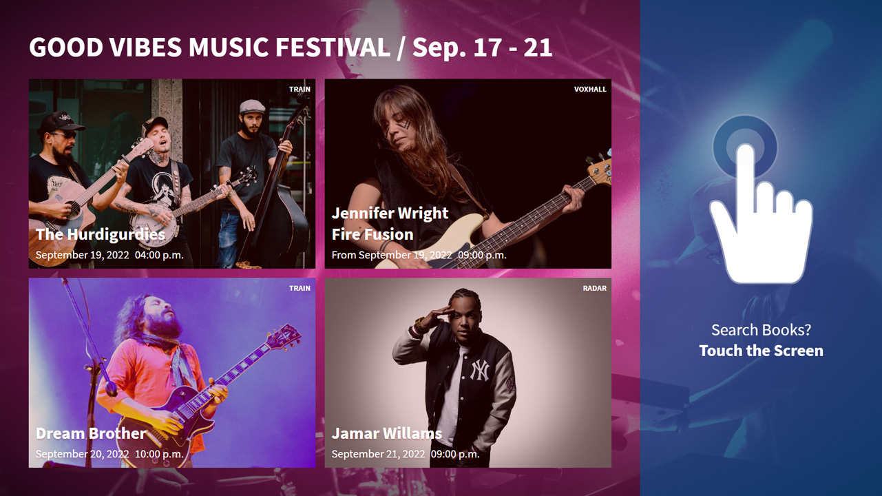
- uniFi+embed - As the name suggests you can display uniFi+ content inside other bibliotheca applications. The +embed display is currently available for controlling promotions on Bibliotheca selfCheck™ through the uniFi+ administration. uniFi+embeds support basic presentations, calendars, and bookshelves. They cycle through their content but can be paused and expanded by touch.
- uniFi+activ - The +activ is interactive and provides displays that patrons can engage with by touching the screen to view specific articles or take part in quizzes or polls. It is designed to allow individuals or small groups to learn about specific subjects in a fun, interactive way. In order to offer interactivity, the monitor must have touch screen capabilities. +activ
-
2.
Content Structure
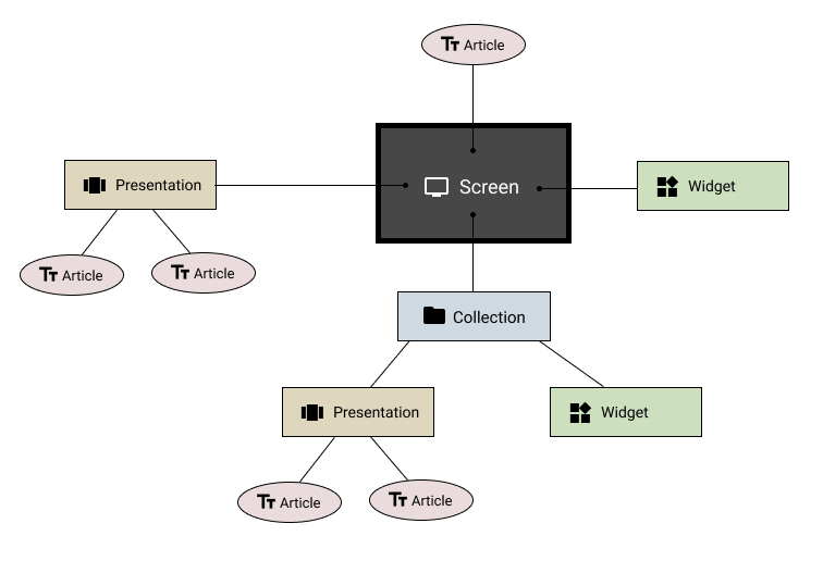
Creating content for uniFi+ you have diferent types of content entities. Articles, Presentations, Widgets and Collections.
The Article is the core of the content. The basic article contains title, text and medias (images, videos, sound). Articles can also be specialized to present a library materal or an event. And it has a long list list of useful features and properties for controlling its behaviour in different presentations.
The Presentation is essentially a collection of articles displayed in a way defined by the specific presentation type.
Some available presentation types are: Bookshelves, Calendars, Basic Article Collections, Timelines and ABClines, etc.The Widget behaves much like a Presentation and will often appear in the same lists. The difference is that widgets are independant, as they do not require articles to be attached. All content and settings are set within the widget itself. Examples are: Weather Report, Wayfinding, Material Search.
The Collection is a package of Presentations and/or Widgets. These are divided into two types: interactive and non-interative.
- Interactive Collections are for uniFi+activs only and are used to create an extra content level.
- Non-interactive collections are for screens as the uniFi+display and uniFi+idle. These collections offer a way to package content for use across multiple screens.
From version 1.10 (February 2022) a screen can have all three content types attached:

-
2.1
The Content Picker
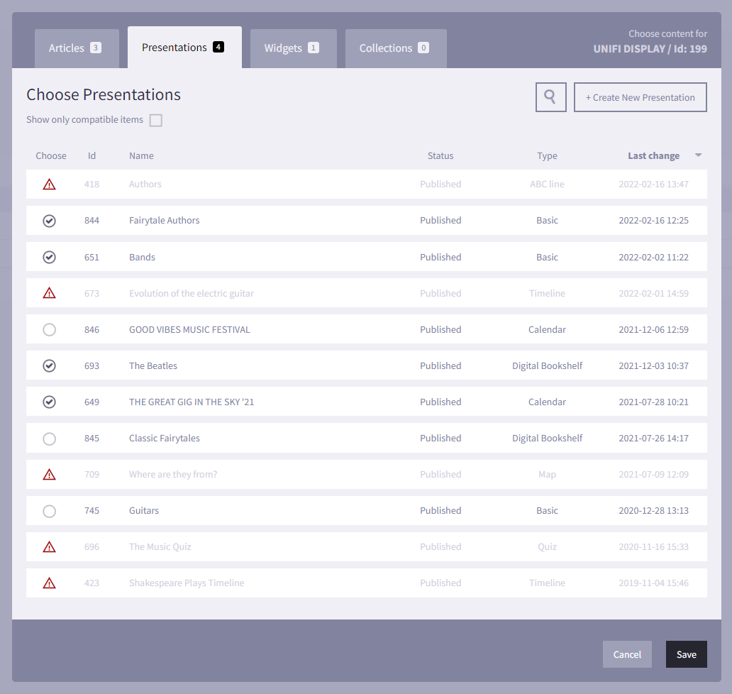
The Content Picker is where you attach content (children) or containers (parents) for any particular entity.
At screen level you can attach all types of entities (image below). The different types are represented in dedicated tabs.
-
3.
Workflow
-
3.1
Non-interactive content (elusive)
The main purpose of the non-interactive screen types (+display, +idle) is to offer a fast and easy workflow for displaying relevant information.
-
3.1.1
Working with manually created articles
When creating articles manually for display-screens, there are a few things you should have in mind:
- Write to the right audience. Who is you target?
- Find the right media to support the message. See supported media
- The medium is elusive, meaning every information slide is timed and will move onto the next one after a while.
Make sure the amount of text is possible to read all the way through in the give time.
Better shorten the text than extending the time!
Full screen media articles: Any message you would like to send to your audience is created through articles. This also includes having "media only"-slides like full screen images or videos. The trick here is just to leave the articles "text"-field blank, and the attached media will fill the entire space.
-
3.1.2
Fast content creation
For uniFi+idle and +displays we encourage you to quickly dive into the Administration to create your content there. You can always save your work as draft, without publishing it, and continue your work whenever you're ready.
Display a simple article "slide"
Start by creating your article with any information you would like to present. Go to Articles and + Add Article.
To catch peoples attention, add some media in the article's media section. Video or imagery.
Attach your article to your +idle or +display screen directly from the article by pressing Choose Screens in the bottom of the content tab. This opens a modal window where you can pick the Screens your article can be added to.
Now go to the Screens-section or the Content Overview where you can preview your article via the
 icon in the right.
 Group articles of the same subject or category in "basic"-presentations
Instead of attaching your articles directly to screens, you might be better of by creating a presentation that holds multiple articles.
On non-interactive screens you can use the "basic"-type presentation.
An example would be to create a basic presentation called "Service Information". Go to Presentations section click + Add Presentation and choose a Basic Presentation.


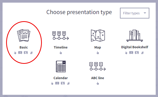
To this you could create and attach articles like "Library WiFi", "Opening hours", "Covid guidelines".
Now all these article are grouped and easier to attach to multiple screens. Just attach the presentation instead of each article.
-
3.1.1
-
3.2
Interactive content (immersive)
With the uniFi+activ you have a generous tool for visualizing history, science, art or any subject in an inviting and edible way.
Here's some tips to make your content worth diving into.
-
3.2.1
Before opening the Administration module
Before you dive straight in to the uniFi+ Administration module and start creating your presentations, it is worth taking some time to ask yourself some big questions and start collecting information, images and even videos and sounds for your chosen subjects.
This will make the process of creating your presentations significantly quicker, easier and stress-free.
Ask yourself
- What is my topic? - Are you putting together a Presentation based on the Dinosaurs, or spotlighting the work of a local author?
- uniFi+activ can display up to five different content entities (article, presentation, widget, collection) on the screen at any one time (six if in vertial view). If you assign more than this amount of entities to a screen, an additional tile will be displayed with the text "More Content..", which will change the tiles to the next content available.
- Do you want to create multiple presentations around the same subject - you can use a Collection to package them into one menu button.
- Who is the audience? - While some presentations cater to all patrons, some may be more tailored for kids (more colourful images and interactive elements) or adults (more specific information).
- What sections of the topic do I want to focus on and what type of presentations works best to display it? - No history of the Romans would be complete without a Timeline, but you can also add presentations that have an interactive map of Ancient Rome, a collection of articles about the most famous emperors, and a fun quiz to see what your patrons have learnt.
- What specific information do I want to display for each presentation? - For example, what dates and events do you want to highlight on your timeline, or which books in an author's catalogue do you want to highlight? Collect your content
Collect your content
- Research your information - You might want to write an article on Julius Caesar, but do you know what year he was assassinated?
- Collect your images, videos and sound clips - The media assets that you collect will give you a better understanding of what the article and presentation will look like. You may also find content that inspires new articles.
- Write your draft articles (in an external editor) - This will save you time and help to keep you organised once you do start creating the presentation. Keep articles relatively short. See our Communication guidelines
- What is my topic? - Are you putting together a Presentation based on the Dinosaurs, or spotlighting the work of a local author?
-
3.2.2
Creating your presentations
Now that you have completed your preparation, you are ready to start building your Presentation.
- Start by creating all the articles that you want to add to the presentation.
- For most presentations, articles are created in the Articles section.
Tip: Tag your articles. This makes it easy to filter out the exact articles you need in a big pool of articles. - For polls, you will also need to create all your polls in the Poll section, and link each one to a separate article.
- For Timelines, you may also add Timeline Texts you want displayed on the background. Timeline Texts are added in the timeline presentation.
- Create a Presentation that you want to add to your Screen - A timeline depicting the "History of the Roman Empire", for example - and link all of the articles that you want to use.
- You can optionally create a Collection if you have multiple presentations with the same topic - The Roman Empire, for example - and link the presentations that you want to use.
- Now link your Presentation (or Collection of presentations) to the screen.
- Preview your work from either the Screens section or the Content Overview Section (Click the monitor icon
 in the right).
-
3.2.1
-
3.3
Service provided content
The core content behind Calendars and Bookshelfs are also articles. A "book"-article can be created manually by creating an article and giving it some extra "material"- properties under the Digital Bookshelf tab. The same goes for events: Add event data (time and location) under the Event tab. Now the article can be used in a Calendar presentation.
But uniFi+ offers to work with external services that provide material or event content. Then uniFi+ transcribes the external content to articles. This makes the process of creating Calendars and Bookshelves a lot easier. AND you can even supplement external content with your own manually created articles.
To get a service-provided Calendar on your screens, jump right into the Presentation section. Create a new presentation by + Add Presentation. Choose the Calendar type and then choose the provider (if any) available in your uniFi+ setup.
For more, follow the steps Creating a Calendar Presentation and Creating a Bookshelf Presentation using LMS/ILS
-
3.4
Widgets
All widget types work on interactive screens and some of them also on non-interactive screens (e.g. Weather Reports).
As widgets require no articles, they are quite easy to apply to your screens and needs less preparation.
Get more information on how to create each individual widget type here.
-
3.1
-
4.
Articles
Articles make up the core content of the uniFi+activ or uniFi+display.
-
4.1
Basic Articles
Basic articles contains title, text and media (images, video, sound) and optionally author information and links to other articles, presentations and widgets.
These can be displayed on a uniFi+activ either directly or as content of "Basic" presentations, as points on a "Map" or as location descriptions in "Wayfinding".
On uniFi+displays articles are shown in a fullscreen window of two fields: One for texts and one for the attached media (as animated slides).
Basic articles are attached to uniFi+displays and uniFi+idles directly or using "Basic" presentations.Articles are reusable - the same article can be attached to multiple presentations across +activ, +display and +idle screens.
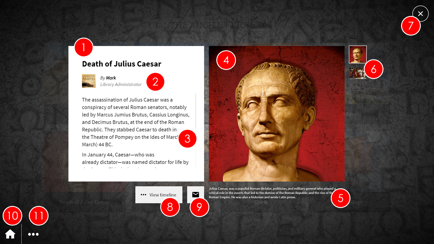
Basic article shown on a uniFi+activ- Title - This is the title of the article. It should be short and to the point (e.g. Death of Julius Caesar, Summer Fair - August 14th, Matilda by Roald Dahl)
- Author image and details - This is the image, name and position of the article author. It is optional.
- Article Text - This is the main article text and is always displayed. The text can be scrolled on screen so the article can contain a lot of text. However, it is recommended that you add some text to the images and media files to avoid the user having to scroll too much on the article text, and make the image / media file text more interesting.
- Current image / media - This is the current image that is being displayed from the associated images and media files for the article. If the patron presses on the image, it will prompt a larger version of the image to be displayed. The image will be replaced by the next image or media file in the roll after a configurable time.
- Current image / media text - This is the text that is associated to the image currently being displayed. If the text is too long, only the beginning of the text will be shown. If the image is pressed, the whole text will be displayed next to a larger version of the image.
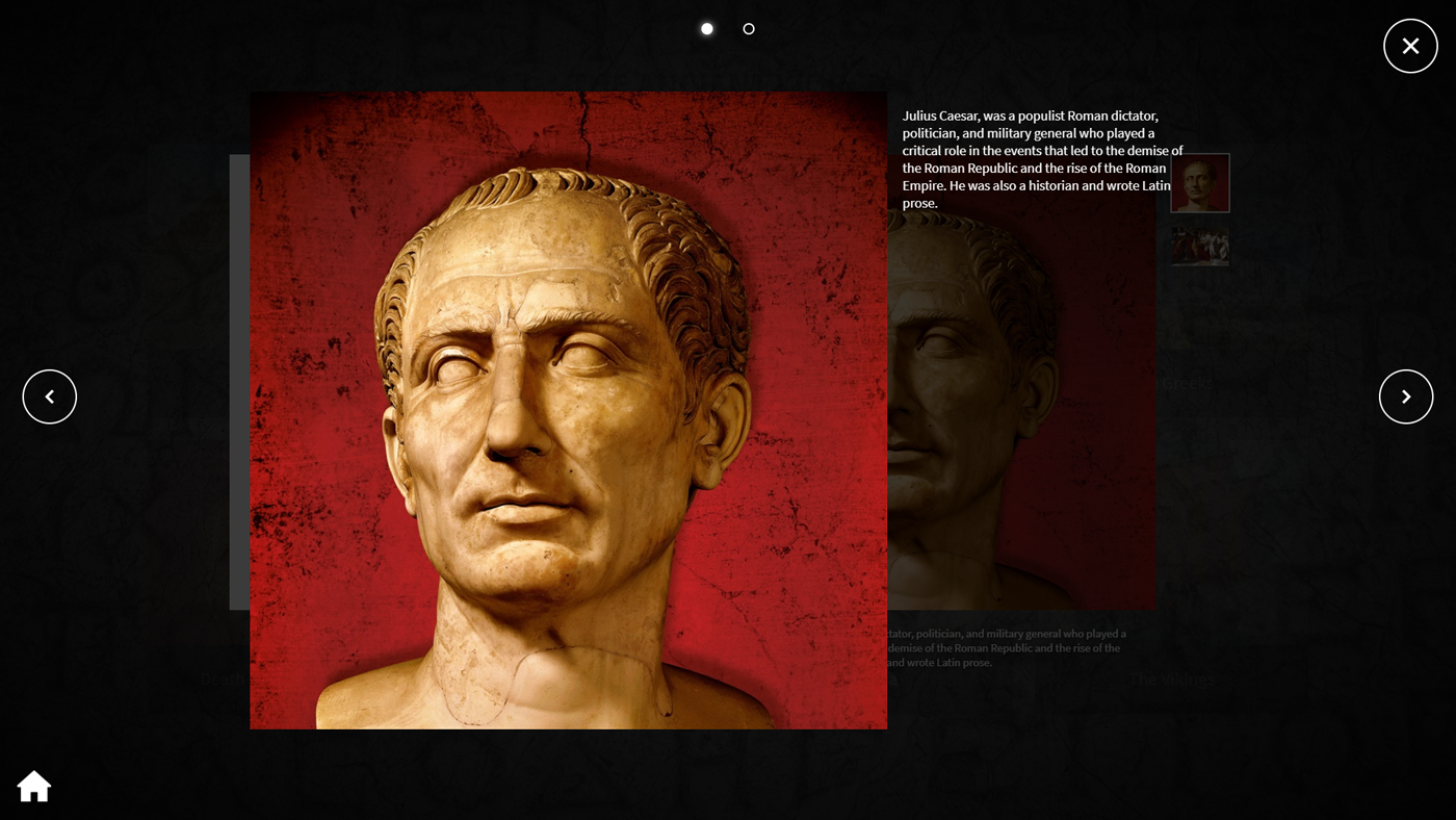
- Image roll - You can see thumbnails of all of the images or media files associated with the article. Each image or media file will be displayed as the current image for a configurable amount of time, as the article cycles through the image roll. If a patron presses on a thumbnail, the image will be displayed as the current image.
- Close - Selecting the "X" icon will close the article, and take the patron back to the presentation.
- Linked articles or presentations - You can see any articles or presentations assocaited to the current article. If the patron presses on the button, they will be taken to the linked article or presentation. If more than one article or presentation is linked to the current article, the button will say "See More" and pressing it will display a list of links.
- E-mail article - The patron can get a copy of the article e-mailed to them by pressing the Email icon and entering their e-mail address.
- Home - Selecting the Home icon will take the patron back to the main screen, where they can pick between the root content of the uniFi+activ.
- Other presentation or widgets in Collection - If the chosen presentation is child of a Collection which has more than one presentation/widget, the patron can select the Ellipsis (...) icon to display a list of the presentations/widgets.
-
4.2
Creating a basic Article
To create a basic Article (Title, Text, Images or Media files with associated text):
- Select Articles from the options in the main menu.

- Select the + Add Article button, l If the article already exists, select the Article title in the list to go to the edit screen.

- In the Edit article section, select the Content tab and add in the article title and the main article text.
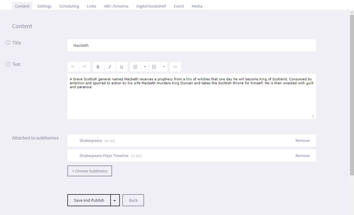
- Select the Save and Publish button at the bottom of the screen. You have created the article and it will now appear under the articles list once you return to it. You can also choose to Save as draft if the article is not ready to publish.
- Select the Media tab and select the + Add Media button.

- Navigate to the location of the media file on your computer and select it.
- The media file will now appear on the Media Tab.
- Select Edit next to the media file. You can change the media file, and add the text that will be displayed with the media file. You should treat the text as a mini-article that gives more specific information about the subject of the image, video or sound file. You can also write an Internal Note such as additional information to research, or the presentations that the article is linked to (and any start and end dates). This text is not seen by patrons.
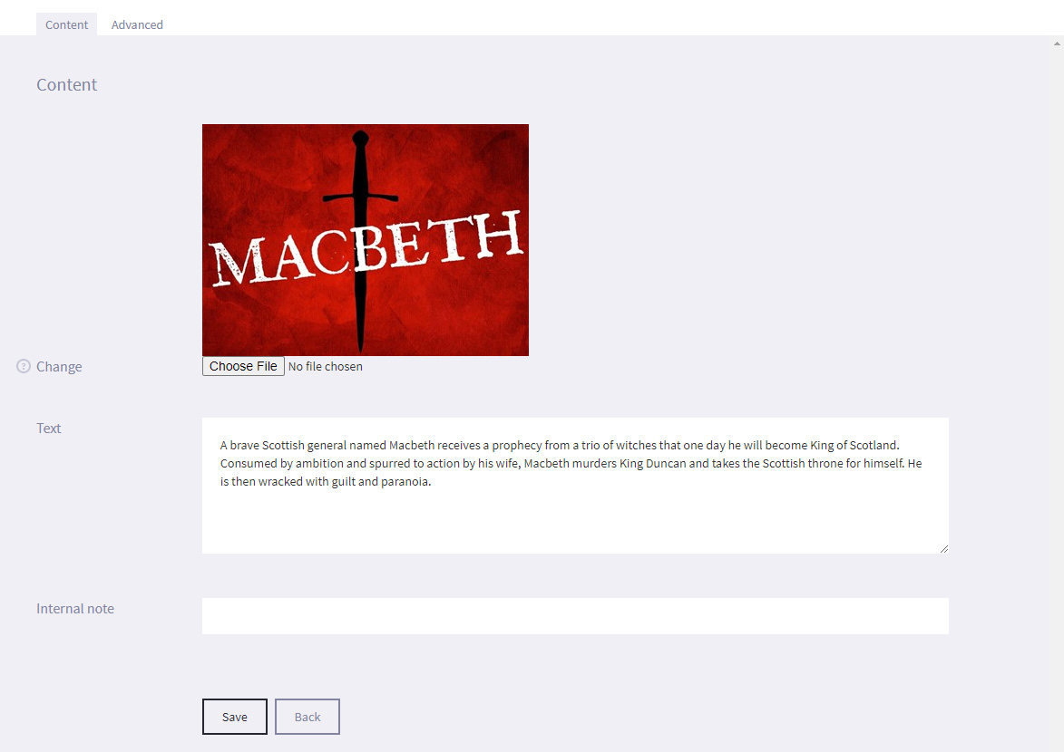
- Select the Save button at the bottom of the screen
- Select Articles from the options in the main menu.
-
4.3
Specialized Articles
Articles can hold additional properties which allow them to be attached to different presentation types, such as Timelines, Bookshelves and Calendars.
ABC-line and Timeline articles
Basic articles are possible to attach to Timelines and ABC-lines, but for them to be placed correctly the article needs an alphabetic index letter or a timeline start year. These are set under the ABC-/timeline tab.
Article as a library material (book, CD, etc.)
For an article to be a part of a "Digital Bookshelf" presentation it must contain material information. This is added under the Digital bookshelf tab.
Check "Activate material data for the article" and fill out the data including Author and Material Type.Now the article can be attached to presentation of the type Digital Bookshelf.
Article as an event
For an article to be a part of a "Calendar" presentation it must contain event information. This is added under the Event tab.
Check "Activate event data for the article" and fill out the data (Location, Start and End time).Now the article can be attached to presentation of the type Calendar.
One article can contain all types of specialization. Which data is used depends on the current presentation type displaying the article.
-
4.4
Creating a "Poll" Article
Each poll that is included in a 'Poll' article needs to be created in the Polls section and then assigned to it's own article. To create the poll:
- Select Polls from the main menu on the left


- Select + Create New Poll
- Enter the name of the Poll in the Title field. The poll title will be shown as the title of the poll on the +activ screen.
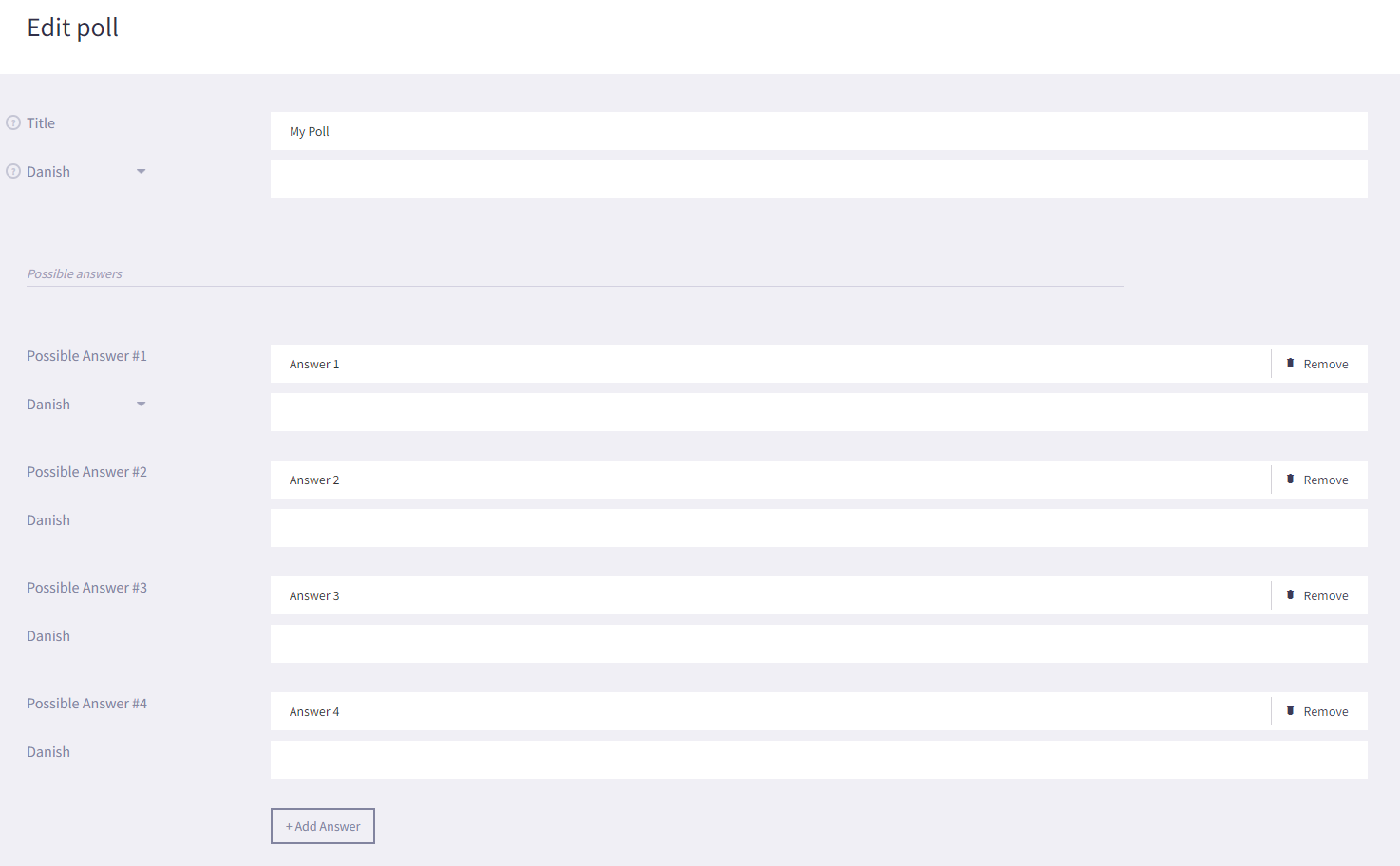
- Select + Add Answer to create a Possible Answer. We recommend creating up to 4 possible answers per poll.
- Enter answers in to the Possible Answer fields.
- Select Save.
To assign the poll to an article:- Select Articles from the options on the Main menu

- Select the + Add Article button
- In the Edit article section, select the Content tab and add in just the article title
- Select Save
- In the Settings section, select the Poll field and use the drop down menu to select the poll you created
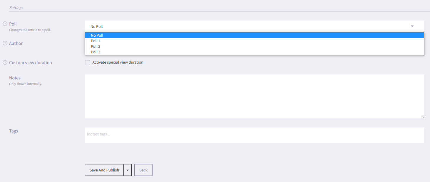
- Select Save
- Select Polls from the main menu on the left
-
4.1
-
5.
Presentations
A Presentation can best be described as the format that you want to display your content (Articles) in.
Cross application display
For Basic, Bookshelves and Calendars, the same presentation can be used across multiple screens, incuding +activs, +displays and +idles.Presentations that only work on +activs, e.g. timeline and quizzes can of course be reused across all your +activ screens.
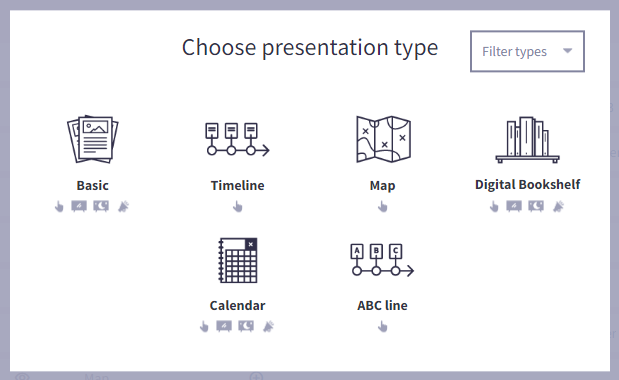
The different presentation types- Basic
As the name suggests it's the basic and most simple presentation for displaying a collection of articles
On uniFi+display / uniFi+idle: A container for fullscreen article slides.
On uniFi+activ: Displays an overview page with multiple selectable articles. - Timeline (uniFi+activ only)
Assign dates to your articles and display them on a horizontal scrollable timeline, with the oldest articles on the left, and the newest on the right.
You can also add “Timeline Texts” to be displayed at specific dates. - Map (uniFi+activ only)
Upload an image and assign articles to different locations on it. - Digital Bookshelf
Display a range of library items as a Digital Bookshelf. Items can be added manually as articles or by searching the LMS / ILS.
Displaying works just like Article Collections with each display types in respect and with material information added to the article.
On uniFi+activ the images are placed on shelves to give a real bookshelf feel. - Calendar
Create event articles manually or pull information from an external source, such as an Events system.
On uniFi+display: Three types of display are available, letting you choose how many events are shown on screen at the same time.
On uniFi+activ: The Calendar acts like a normal Article Collection, but with event information added to the article. - ABC line (uniFi+activ only)
Display articles on a line in alphabetical order, either based on the first letter of the article title or a specified letter.

-
5.1
Basic
On uniFi+activ the Basic presentation type displays the articles as tiles on the screen. The patron can simply press the relevant tile to see the article in full. There are typically space for eight article buttons. When exceeding this you can chose if the user should scroll sideways or vertically.
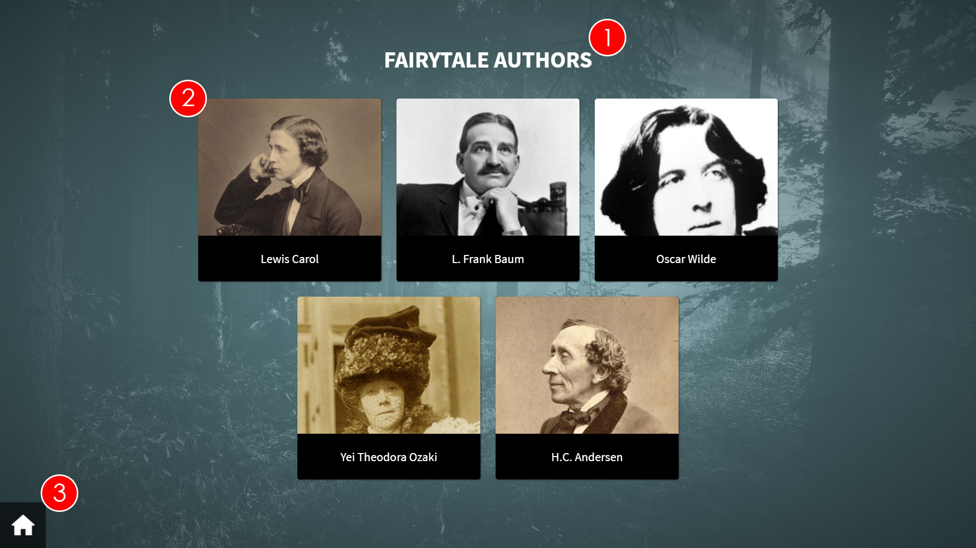
- Presentation Title - This is the title of the presentation.
- Article Tile - Selecting this tile will prompt the article to be displayed in full. If you link a question article to the Article Collection presentation, selecting the tile will display the article image only.
The article that is at the top of the Assigned Articles list will be displayed first (the Death of Julius Caesar article in the screenshot above), with subsequent articles being displayed as ordered in the list. - Home - Selecting the Home icon will take the patron back to the main screen, where they can pick between the root content of the uniFi+activ.
- Additional presentations/widgets - Selecting the Ellipsis (...) button will bring up a list of other presentations (or widgets) linked to the currently selected Collection. The patron can select one of the listed presentations/widgets and be taken to the relevant screen.
On uniFi+display / uniFi+idles the same information is displayed but only one article at the time and with the whole article text shown.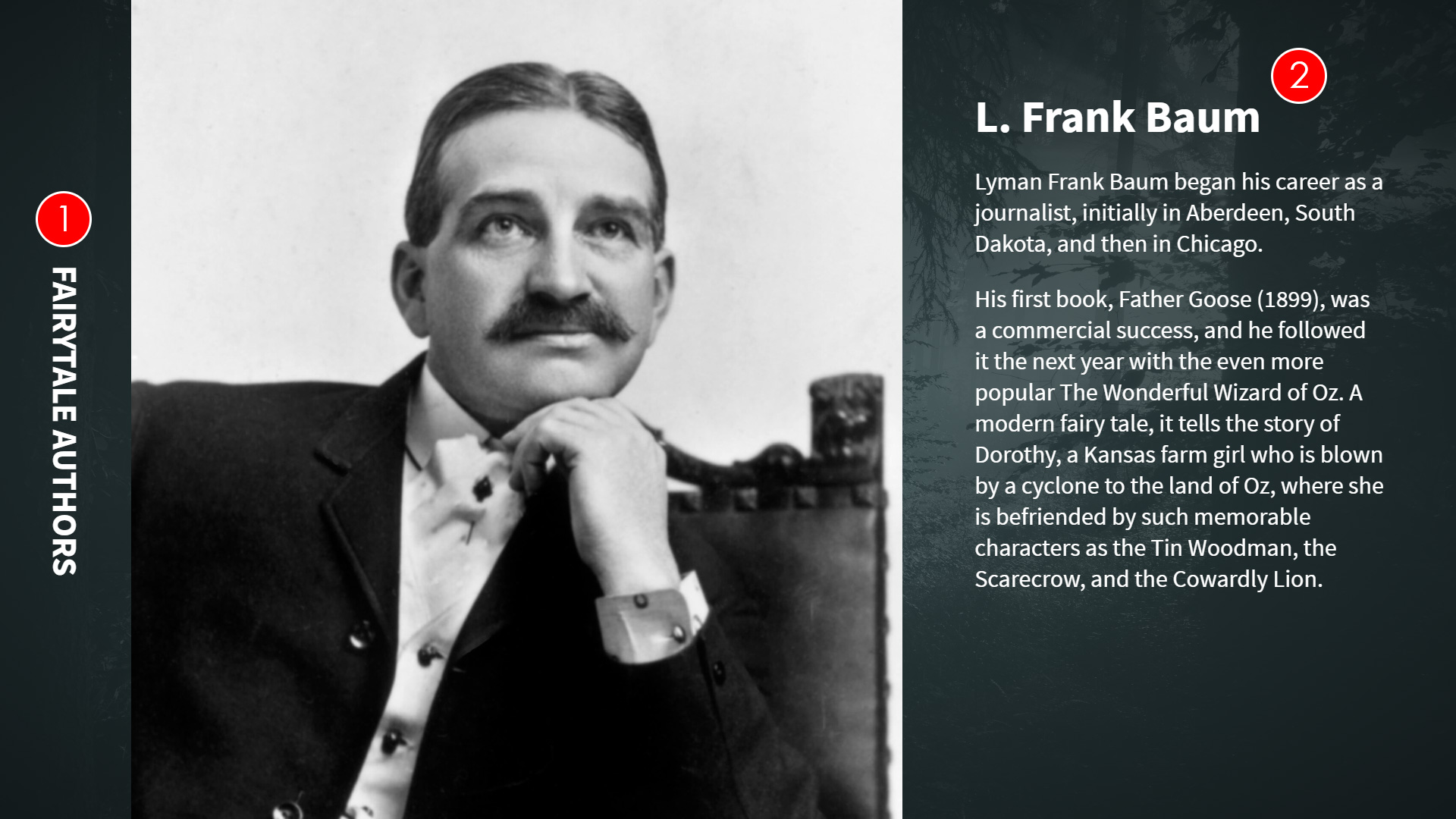
-
5.1.1
Creating a "Basic" presentation
To create an Basic presentation:
- Select Presentations from the options on the Main screen.

- Select + Add Presentation and choose the "Basic" presentation.
- Under the Content tab, enter the Title and Text.
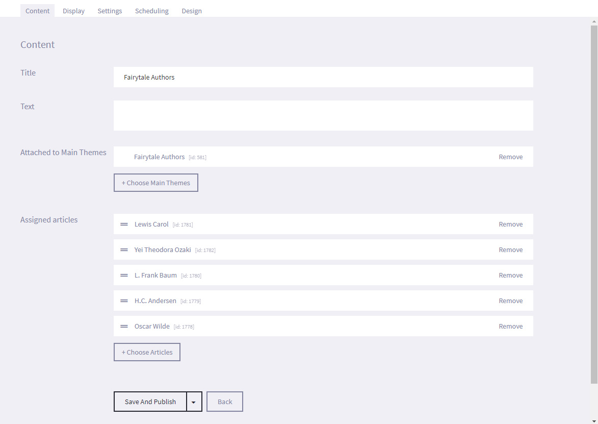
- Select the + Choose Articles and link the required link articles to the presentation.
You can add Poll articles to link Polls to the Basic presentationYou can reorder the order in which the assigned articles are displayed by scrolling over the required article (until you see a hand icon) and moving the article up and down the list, as desired.

- Select Save.
- Under the Display tab, select the format (Square or Standard) that you wish to display the Article tiles in from the Display variants settings. Only relevant for uniFi+activ devices.

- Select Save and Publish (or Save as draft if not ready to publish)
- Under the Settings tab you can select the Show title on +display and +idles checkbox if you want the title of the presentation to be displayed on each article within the article collection. This only applies to articles used on +display or as +idles.
- Additionally, you can assign tags to presentation so that it is easier to search for later. For example, if the presentation is part of your Roman collection, you can enter a tag such as Rome on all articles and presentations that should be included, or you could also enter a tag such as Julius Caesar so that you can quickly search for a specific subject. You can add multiple tags to a presentation or article.
- From the Scheduling tab, you can set a time limit for the specific dates and times that the presentation will be displayed by selecting Active time limit and entering the required Start and End dates and times.
- Under the Design tab, select Choose File and navigate to the location of the image to use as a background image.
We recommend a resolution of 1920 x 1080 pixel for applications in landscape view. - Select Save and Publish (or Save as draft if not ready to publish).
- Select Presentations from the options on the Main screen.
-
5.2
Digital Bookshelf
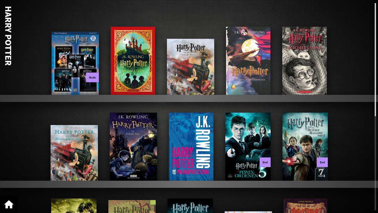
On uniFi+activs, a Digital Bookshelf is a simple display of books or other materials (articles) placed on one or more shelves - and you can configure the view to scroll either vertically or horizontally.
On uniFi+displays / uniFi+idles the materials of the presentation are presented one at the time, with an image (e.g. bookcover) on the left and information on the right.
The articles you attach to a Digital Bookshelf has to be specialized as a library material, containing material type, author, location and more.
See Specialized Articles.Note: Scandinavian countries can use ILS/LMS to automatically create bookshelf-presentations from a material database by using search queries. More on that in a later paragraph.
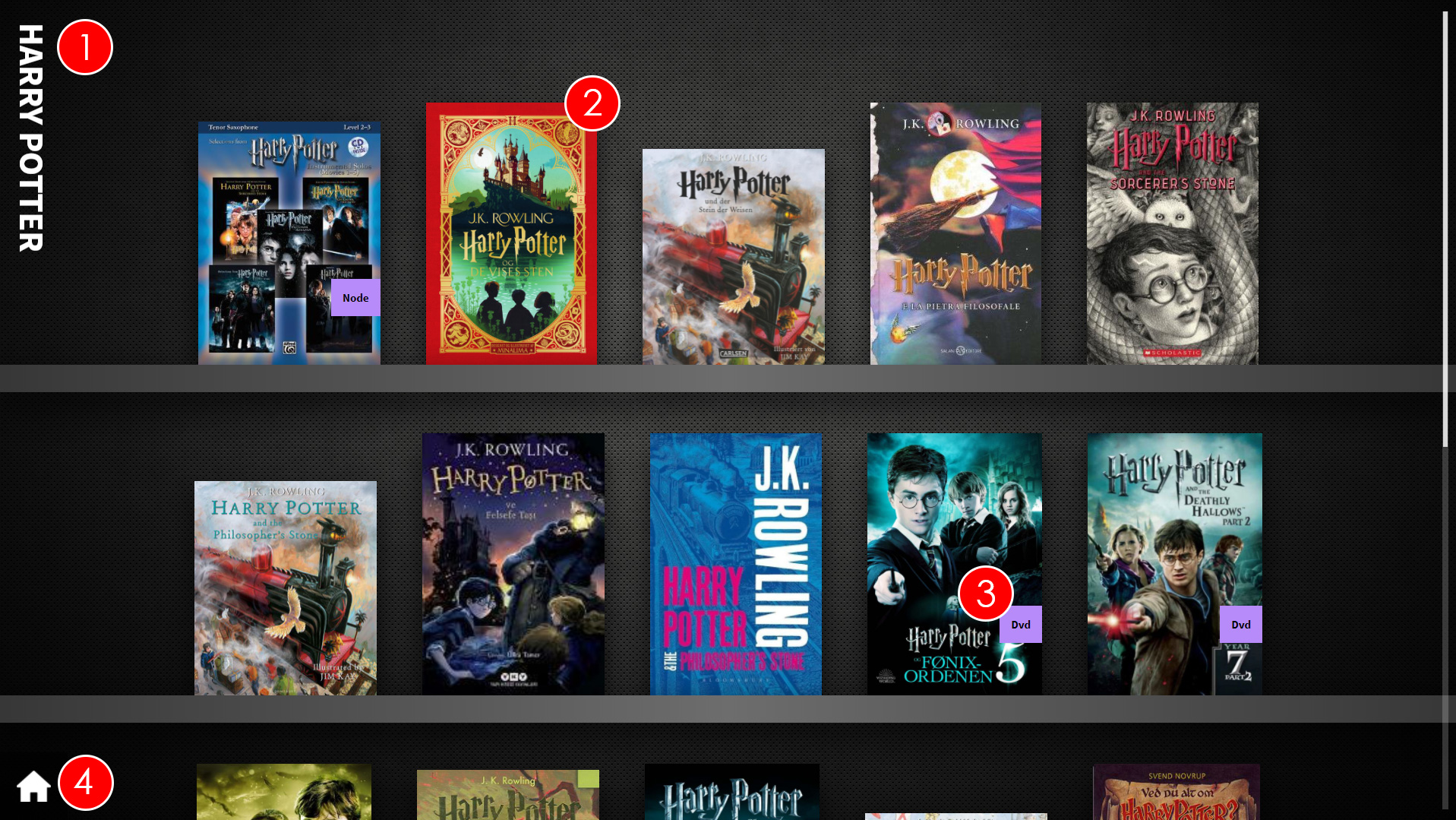
- Bookshelf title - This is the presentation title. It should let the patron know the common link between the items on the bookshelf.
This could be that they are all by a single author, in a single genre, about the same subject or are recommended reads / new items in the library. - Item Cover - This is the cover of the item - the first image in the articles media section or as pulled from the LMS / ILS.
- Item Type - This is the item type label and tells the patron if the item is a Book, DVD, CD, eBook or Game.
- Home - Selecting the Home icon will take the patron back to the main screen, where they can pick between the root content of the uniFi+activ.
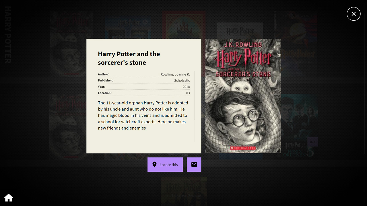
If the patron presses one of the covers on screen, the item information for the selected item will be displayed.
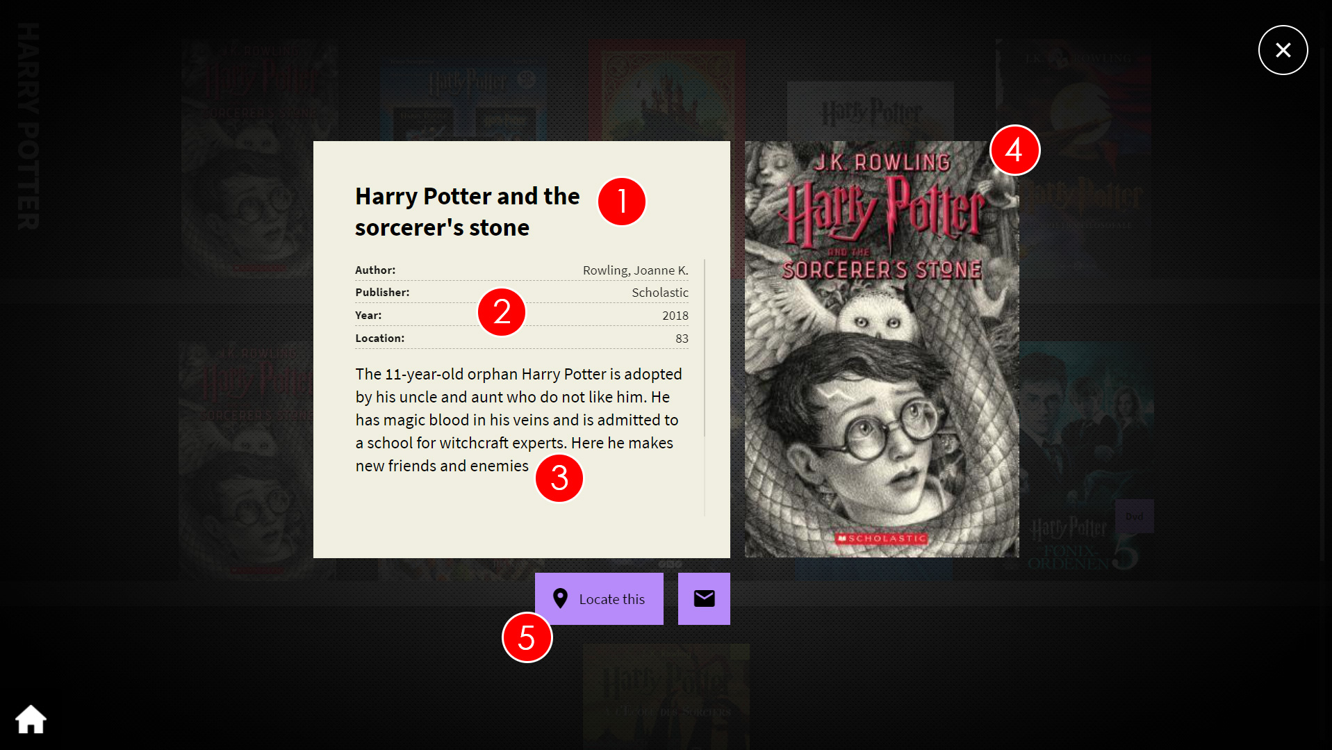
- Item Title - This is the item title.
- Item Information - This is the Author, Location and Item Type information for the selected item.
- Item Text - This is the summary text for the selected item.
- Item Cover - This is the cover of the item (the first image in articles media list).
- Locate items via wayfinding - This function is only available if the uniFi+activ has a wayfinding widget, and this contains a location mark spanning over the items location number.
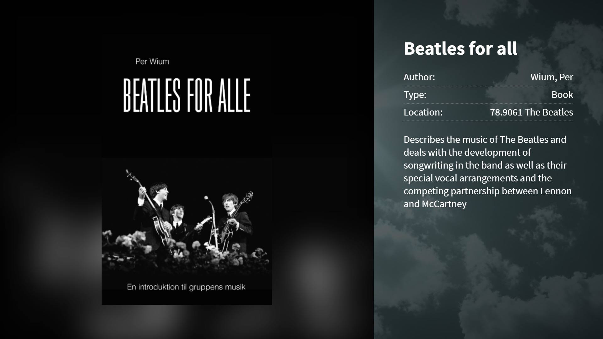
Book display on +display-
5.2.1
Creating a Digital Bookshelf article
To create a Digital Bookshelf Article:
- Select Articles from the options on the Main screen.

- Select the + Add Article button, l If the article already exists, select the Edit button next to the Article title in the list.
- In the Edit article section, select the Content tab and add in the Item title and the item description text.
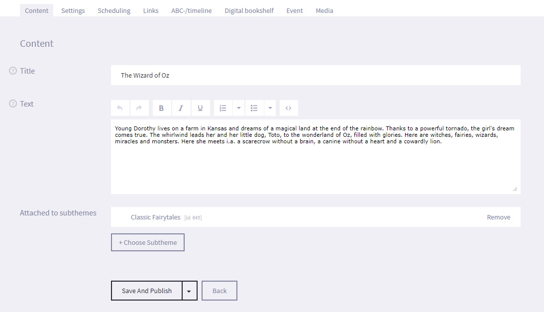
- Select the Save button at the bottom of the screen. You have created the article and it will now appear under the articles list once you return to it.
- Select the Digital bookshelf tab and enable the Active book data for the article setting in the Book Information field.
- Configure the Location, Author and Material Type settings that appear.
- Location - The location of the item in the library.
- Author - The author of the item.
- Material Type - The item type of the item. Select from Book, DVD, CD, eBook and Game.
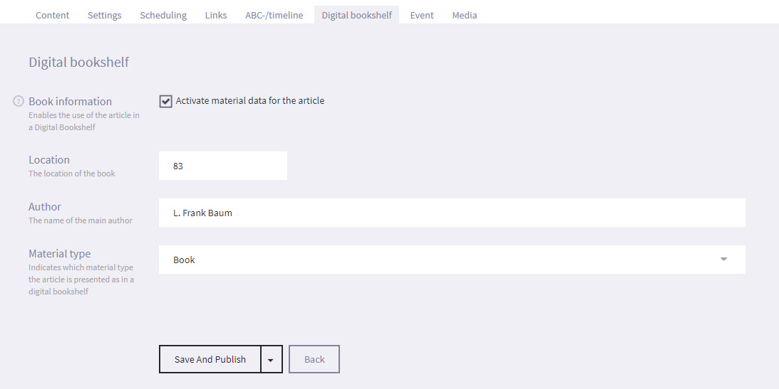
- Select Save.
- Select the Media tab and select the + Add Picture button to specify the item cover.
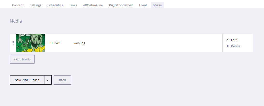
- Navigate to the location of the media file on your computer and select it.
- The media file will now appear on the Media Tab.
- Select Edit next to the media file. You can change the media file, and add the text that will be displayed with the media file.
You should treat the text as a mini-article that gives more specific information about the subject of the image, video or sound file.You can also write an Internal Note such as additional information to research, or the presentations that the article is linked to (and any start and end dates). This text is not seen by patrons. - Select the Save button at the bottom of the screen.
- Select Articles from the options on the Main screen.
-
5.2.2
Creating a Digital Bookshelf
To create a Bookshelf presentation:
- Select Presentation from the options on the Main screen.

- Select + Add Presentation and choose the Digital Bookshelf presentation.
- You will see the Edit screen. Under the Content tab, enter the Title (which will be displayed on screen) and optional Text (which is not displayed on screen).
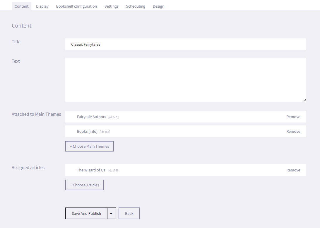
- Select Save and Publish (or Save as draft if not ready to publish).
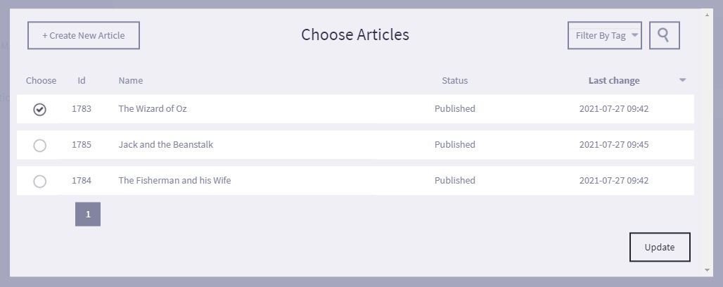
- Now for adding items, select + Choose Article next to the "Assigned articles" field, and select the articles required and Update. Only articles that have had Digital Bookshelf functionality enabled will appear in the list.
- Select Save.
- Under the Design tab, select Choose File and navigate to an image on your computer to use the selected image as a Background for your Digital Bookshelf.
- Select Save.
- Select Presentation from the options on the Main screen.
-
5.2.3
Creating a Digital Bookshelf using LMS/ILS
To create a Bookshelf presentation using ILS/LMS (so far Scandivavian countries only):
- Select Presentation from the options on the Main screen.

- Select + Add Presentation and choose the Digital Bookshelf presentation.
- You will see the Edit screen. Under the Content tab, enter the Title (which will be displayed on screen) and optional Text (which is not displayed on screen).
- Select Save and Publish (or Save as draft if not ready to publish).
- Under the Bookshelf Configuration tab, set the maximum number of results that willbe pulled from the LMS / ILS to appear on the bookshelves in the No. of materials for the CQL query field, and tick the Include only results with image to only show results that the LMS / ILS has a cover image for.
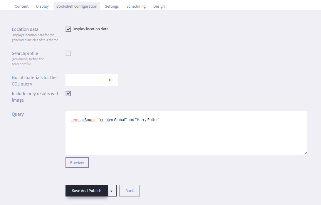
- Create a CQLQuery .
For example, term.acSource="database name" and "search word"
term.acSource="ereolen Global" and "Harry Potter" - Select Preview to see the results that have been pulled from the LMS / ILS.
Scrolling over a cover will enlarge the image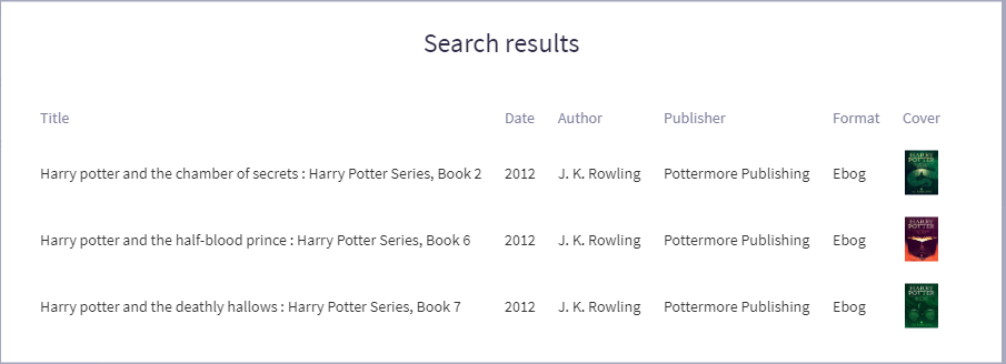
- Select Save.
- You can still manually add additional material items: Go back to the Content -tab. Select + Choose Article next to the Assigned articles field, and select the articles required and Update. Only articles that have had Digital Bookshelf functionality enabled will appear in the list.
- Under the Design tab, select Choose File and navigate to an image on your computer to use the selected image as a Background for your Digital Bookshelf.
- Select Save.
- Select Presentation from the options on the Main screen.
- Bookshelf title - This is the presentation title. It should let the patron know the common link between the items on the bookshelf.
-
5.3
Calendar
Links to external sources (Event systems, RSS feeds, websites) must be configured by bibliotheca.
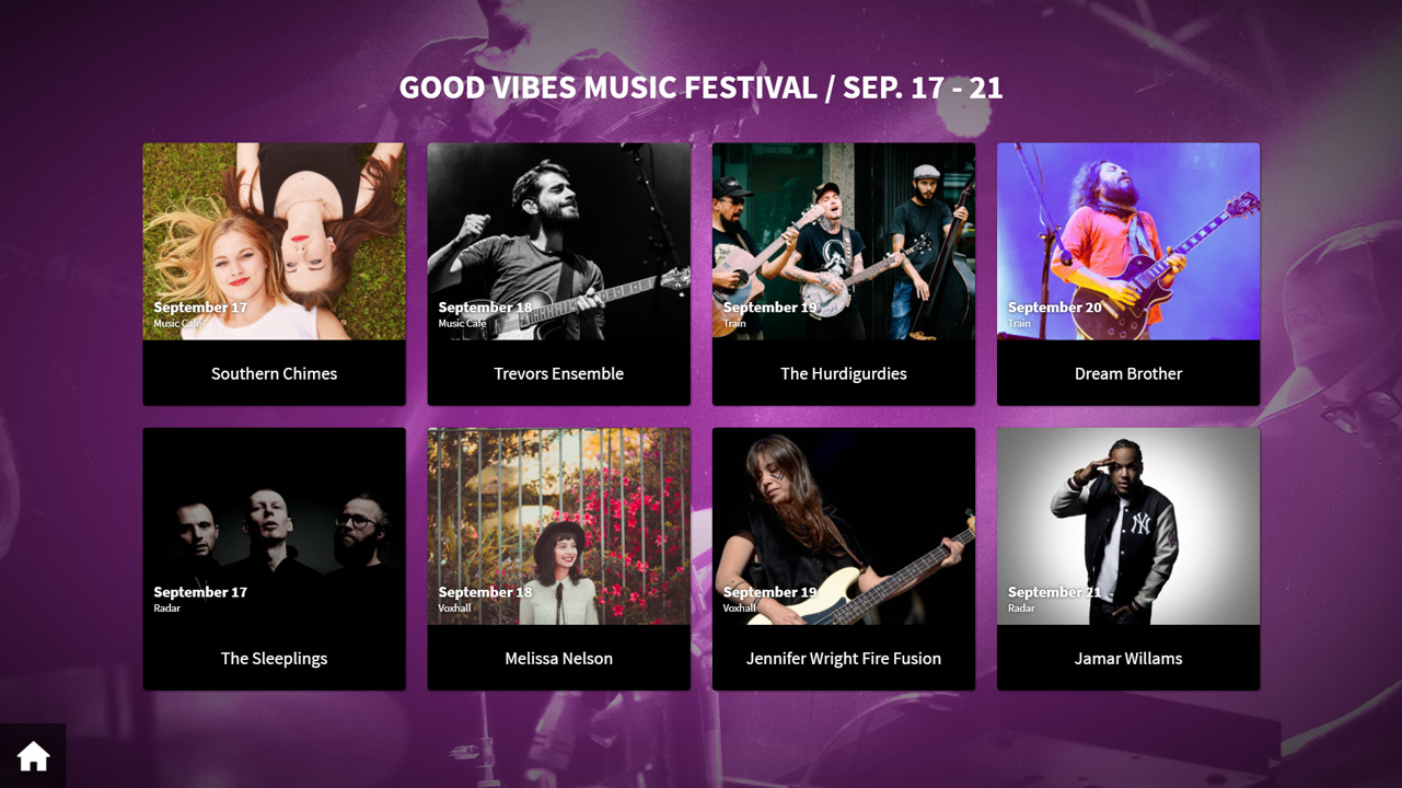
A Calendar is a presentation that pulls information from an external source, such as an Events system, and displays it on screen as tiles that can be pressed to get more information. If you have no external event integrations, it is possible to create your own event articles, see Articles section. The images below show an example of information pulled from an Events system.
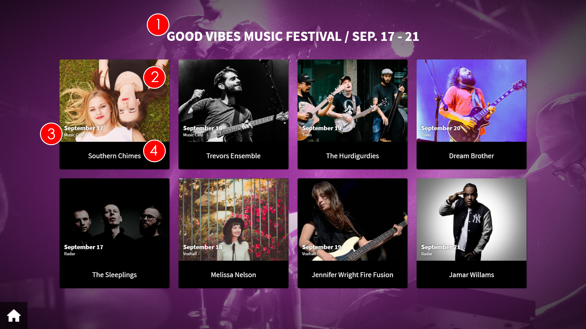
- Presentation title- This is the title of the presentation
- Event Image - This is the image associated to the event, as pulled from the external system.
- Event Date - This is the date of the event, as pulled from the external system.
- Event Title - This is the title of the event, as pulled from the external system
If the patron presses one of the tiles on screen, the information for the selected event will be displayed.
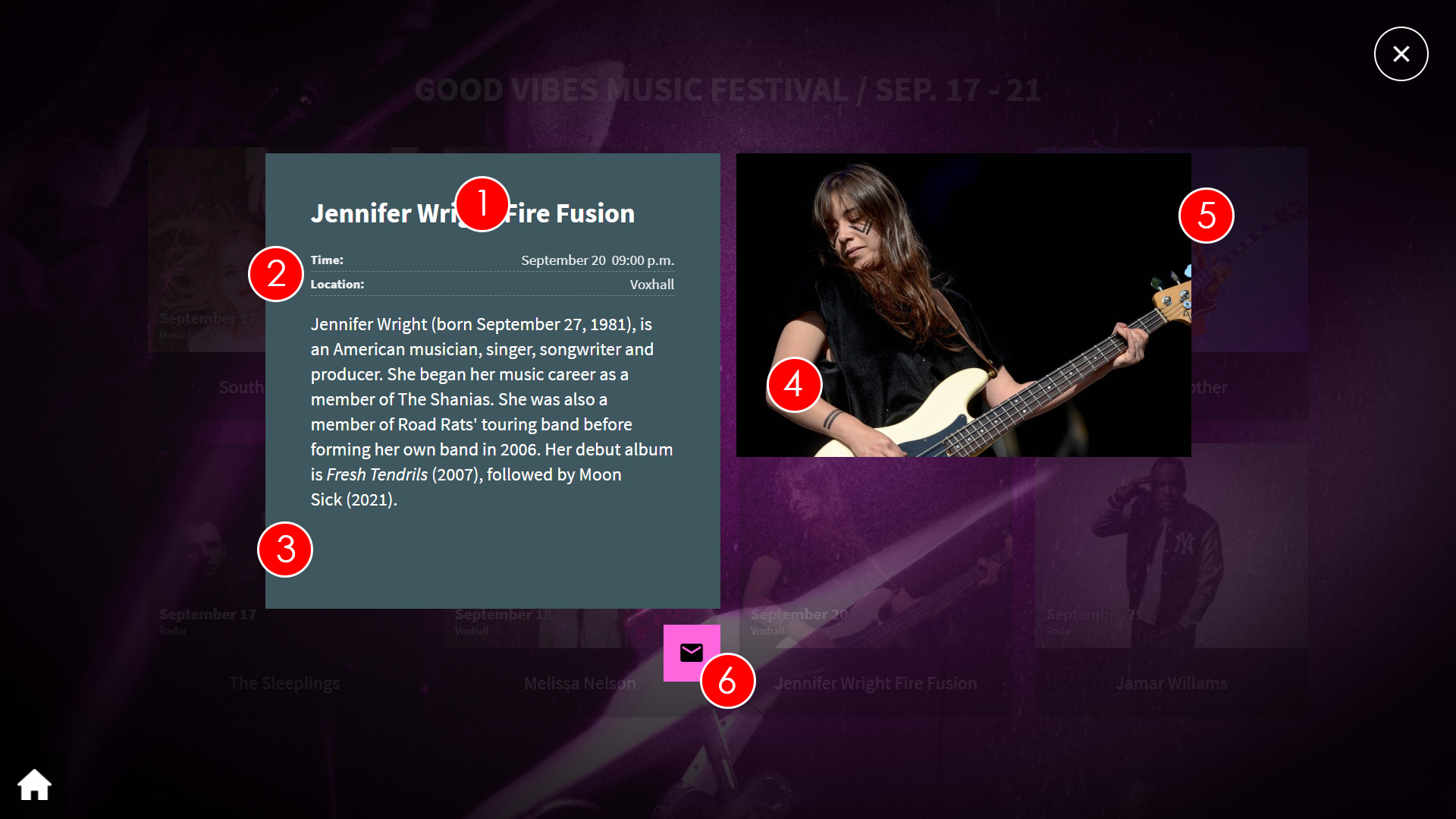
- Event Title - This is the title of the event, as pulled from the external system.
- Event Details - This is the location and time and date of the event, as pulled from the external system.
- Event Information - This is the description of the event, as pulled from the external system.
- Event Image - This is the image associated to the event, as pulled from the external system.
- Sound in image - Only possible for manually created articles, see sound in image
- Send article to mail - The patron can here insert their e-mail address, and get the article sent so they can read up on it later
On uniFi+display / +idle you can show one, four or up to 28 events at the same time with the new "Flexical"-display. More on the display type below.
The "Flexical"-display-
5.3.1
Creating a Calendar
To create a Calendar presentation:
- Select Presentations from the options on the Main screen.

- Select + Add Presentation and choose "Calendar".
- If you have an integration to one or more external event feed sources, you will be able to select which feed you want data from.
- You will see the Edit screen. Under the Content tab, enter the Title (which will be displayed on screen) and optional Text (which is not displayed on screen).
- Select Save
- Set desired calendar limitations under the Calendar configuration tab.
Enable the Time limit checkbox to specify the maximum number of days the calendar will look into the future.
E.g. enter 30 to limit the calendar to look one month ahead.
To create a day-overview on +display / +idles, set this limit to 1, and choose the "Flexical" (Up to 28 events in one page) display under the Display tab. Hereby the calendar will only show events of the current day, and only hours will be shown. No dates.
Enable the Quantity Limit checkbox to specify how many events will be displayed.
E.g. if 10 is entered, the amount of active (not yet held) events in the presentation will never exceed 10.
Enable the Location limit checkbox to only show events for a selected location (i.e. local branch).
Use the drop down Location menu to select the location that you want to display the events for.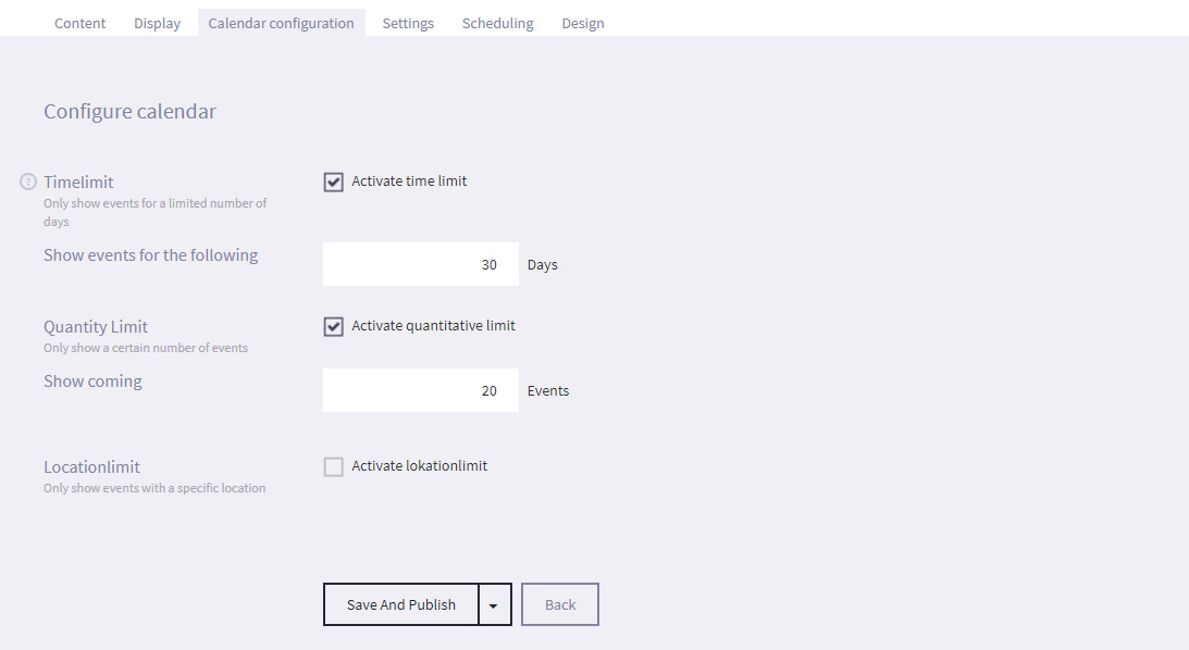
- Select Save
- Under the Design tab, select Choose File and navigate to an image on your computer to use the selected image as a Background for your Calendar.
- Select Save
- Select Presentations from the options on the Main screen.
-
5.3.2
Calendar display variants
A calendar presentation can be displayed in multible ways on both +activ and +display / +idle screens.
To select a display variant click the Display tab
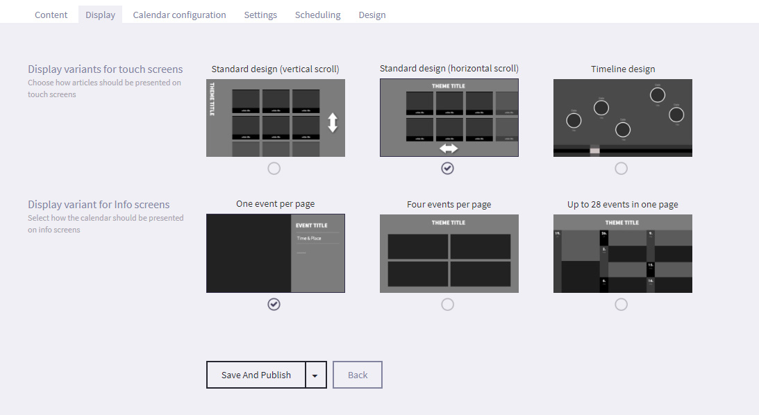
+activ display variants
- Standard design (vertical scroll)
As standard article collection. Rotated title placed in the left. - Standard design (horizontal scroll)
As standard article collection. Title placed in the top center. - Timeline design
Places events on chronological timeline. Events with same dates are placed in the same button.
+display and +idle display variants
- Single:
One event per page. Presenting the full article content. Looping through all events by multiple pages - Four Tiles:
Four events per page. Looping through all events by multiple pages - "Flexical" - NEW*
Up to 28 events per page. One page only. If calendar counts more than 28 events, the rest are not displayed

Tip: To create a "todays events" +display page
(This requires that the events are coming from an external provider)
1. Choose "flexical" display variant
2. Goto the Settings tab and select Show events for the following 1 day - Standard design (vertical scroll)
-
5.4
Timeline
(+activs only)
A Timeline is a presentation that shows the events of a specific time period. Articles and Timeline text are displayed on the time line at specific dates, and the timeline automatically scrolls to depict the passage of time. Patrons can manually scroll along the timeline and touch article icons to view the article in full.
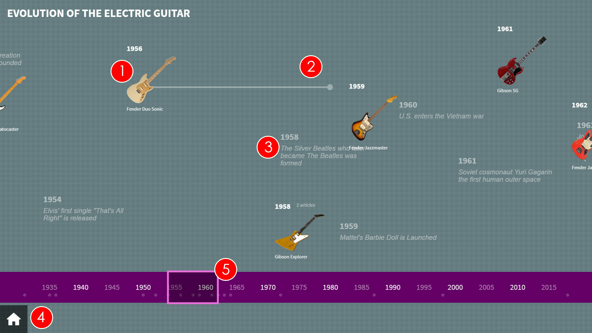
- Article Image - This is the image for the article. If pressed, the full article will be displayed. The example above uses icon images, which are uploaded in the timeline tab of the article. These are great for images with transparency.
- Article duration - If you set the article's End Year to a later year than Start Year, you will see a line from the article button that starts at the Start Year for the article and ends at the End Year.
- Timeline Text - Any Timeline text that has been assigned to the timeline will be displayed. It will appear at the configured year.
- Home - Selecting the Home icon will take the patron back to the main screen, where they can pick between the root content items of the uniFi+activ.
- Timeline - The timeline automatically scrolls from the earliest year on the timeline to the latest year on the time. Patrons can manually scroll the timeline in either direction.
-
5.4.1
Creating a "Timeline"
To create a basic timeline presentation (Title, Background image, linked Articles and timeline text):
- Select Presentations from the options on the Main menu

- Select + Add Presentation and choose the TimeLine presentation.
- You will see the Edit screen. Under the Content tab, enter the Title (which will be displayed on screen) and optional Text (which is not displayed on screen)
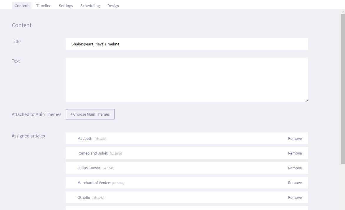
- Select Save and Publish (or Save as draft if presentation is not ready to publish).
- Select the + Choose Articles to link articles to the Timeline.
- The articles must have at least a Start year set in the Edit Article > Timeline tab settings, and an End year if the time period relating to the article is over several years (e.g. the life of Julius Caesar - 100 BC to 44 BC).
- Under the Timeline tab, use the Timeline objects drop down menu to select how the buttons that link to the articles appear on the timeline.
- Either set the Start year and End year you want for the specific timeline, or select Automatic after articles to automatically create a timeline based on the dates attributed to the articles.
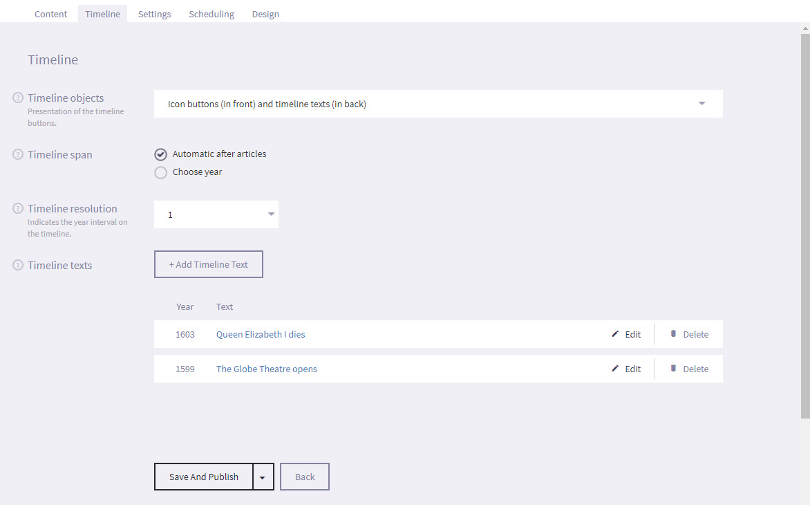
- Use the Timeline resolution drop down menu to select the frequency that the length of time on the timeline is displayed in. For example, a timeline spanning 1000 years could have a resolution of 50 years to reduce the need for scrolling back and forth.
- Timeline texts is a list of texts to support or add perspective to the timeline presentation. Each text are attached to a year and will be displayed as flat text (not interactive) on the timeline.
- Under the Settings tab, you can assign tags to presentation so that it is easier to search for later. For example, if the presentation is part of your Roman collection, you can enter a tag such as Rome on all articles and presentations that should be included, or you could also enter a tag such as Julius Caesar so that you can quickly search for a specific subject. You can add multiple tags to a presentation or article.
- Under the Scheduling tab, you can set a time limit for the specific dates and times that the presentation will be displayed by selecting Active time limit and entering the required Start and End dates and times.
- Under the Design tab, select Choose File and navigate to an image on your computer to use the selected image as a Background for your timeline.
If you are using multiple timeline presentations to create one long timeline, consider creating one large image and dividing it in to smaller images (one for each timeline). This way, it will look like the continuation of one timeline. - Select Save.
- Select Presentations from the options on the Main menu
-
5.5
Map
(+activs only)
A Map is a presentation that attaches articles to different points on an image of a map. Patrons can select the image icon for the article to view the article in full.
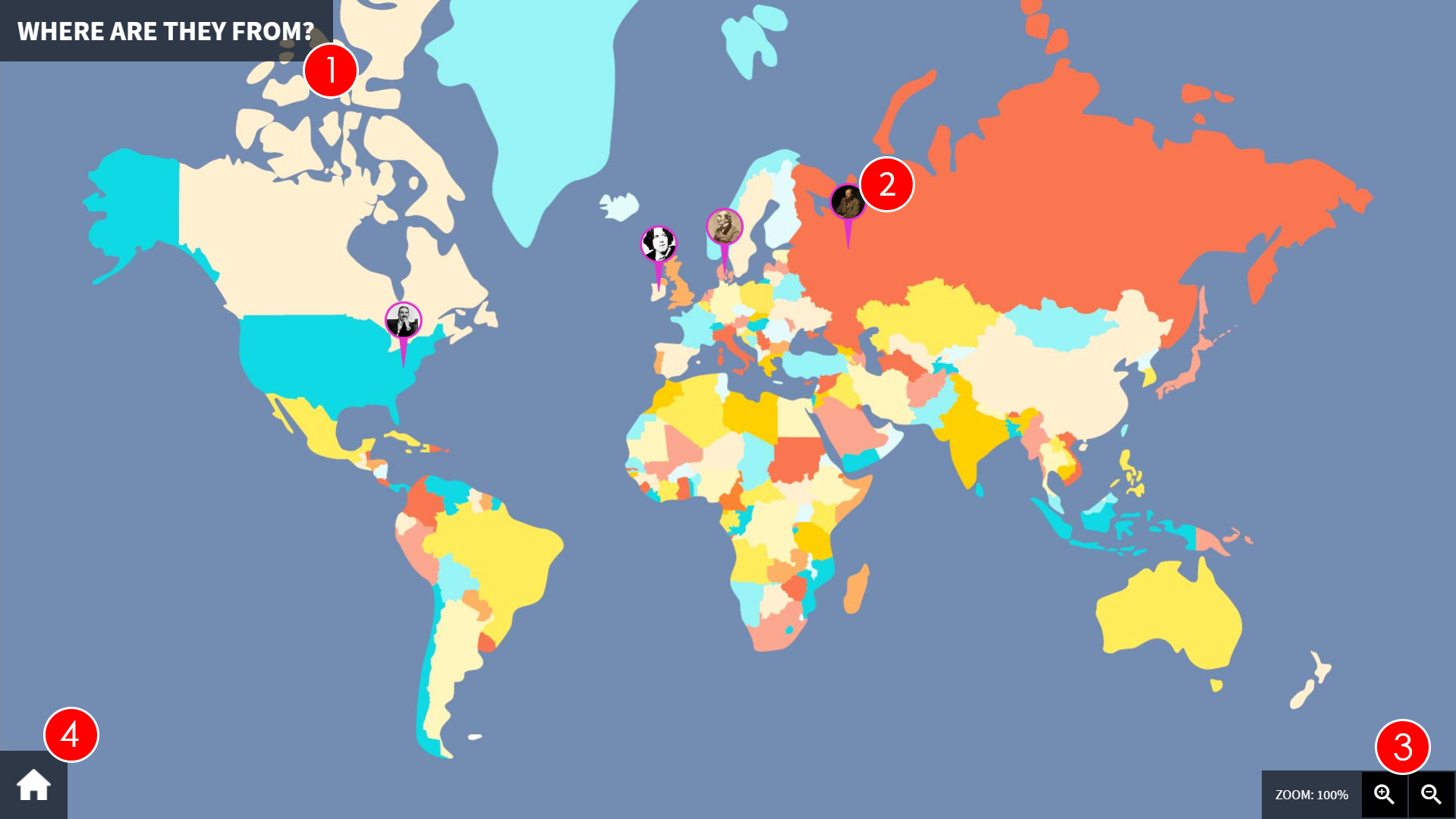
- Presentation Title - This is the title of the presentation.
- Article Image - This is the image that is associated to the article. The image needs to relate to the subject of the article and be placed at the relevant point on the map. For example a picture of The Colosseum would indicate an article either about the building itself or possibly Rome in general, and would be located where Rome is on the map.
- Zoom - Patrons can use the "+" and "-" buttons to zoom in and out of the image. This is especially useful if a certain area of the map has a large number of articles in close proximity.
- Home - Selecting the Home icon will take the patron back to the main screen, where they can pick between the root items attached to the uniFi+activ.
-
5.5.1
Creating a "Map"
To create a basic map presentation (Title, Text, background image and linked Articles):
- Select Presentations from the options on the Main menu

- Select + Add Presentation and choose the Map presentation.
- Under the Content tab, enter the Title and Text.
- Select Choose File and browse to the location of image you want to use as your map. This is the image that the articles will be attached to so it should be a good quality image.
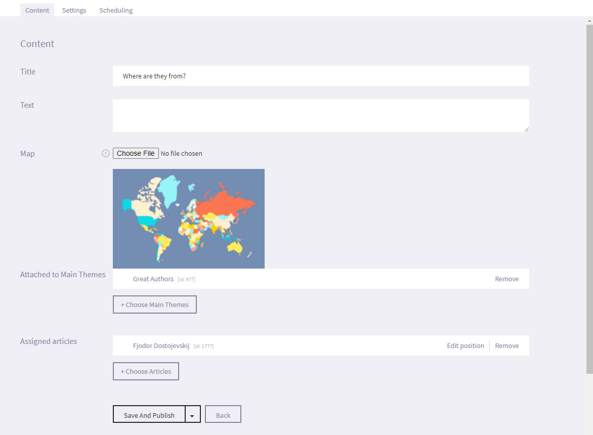
- Select the + Choose Articles and link the required articles to the Map.
- Select Edit Position next to each required article.
- Select a point on the map where you want the image icon for the chosen article to be displayed. The position is displayed as a green dot. Select Save Position.
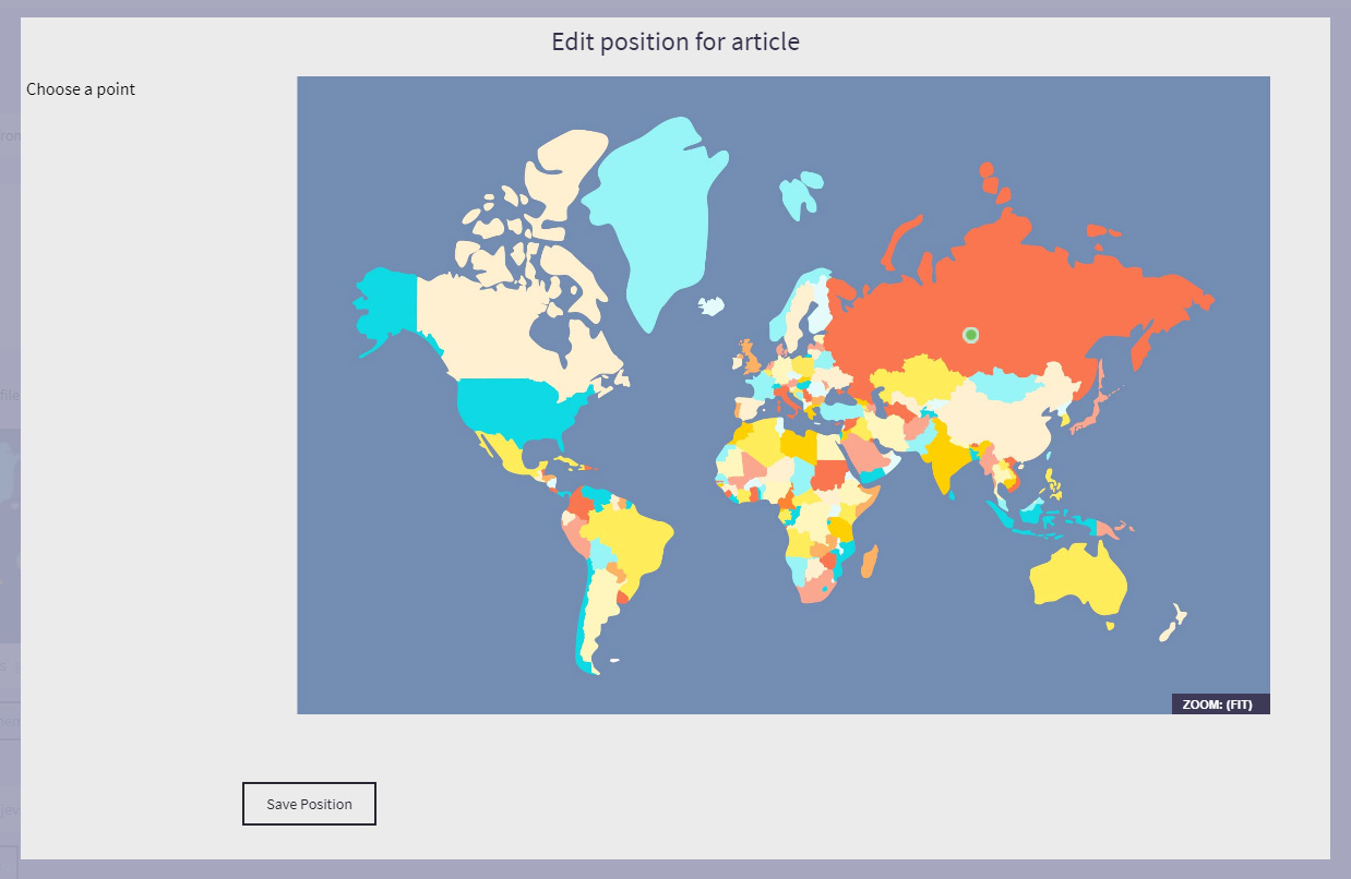
- Under the Settings tab, you can assign tags to presentation so that it is easier to search for later. For example, if the presentation is part of your Roman collection, you can enter a tag such as Rome on all articles and presentations that should be included, or you could also enter a tag such as Julius Caesar so that you can quickly search for a specific subject. You can add multiple tags to a presentation, widget or article.
- Under the Scheduling tab, you can set a time limit for the specific dates and times that the presentation will be displayed by selecting Active time limit and entering the required Start and End dates and times.
- Select Save
- Select Presentations from the options on the Main menu
-
5.6
ABC line
(+activs only)
The ABC line presentation is used to display articles in alphabetical order on a scrollable line (similar to using a timeline to display articles based on dates).
Patrons can manually scroll along the ABC line and touch article icons to view the article in full.
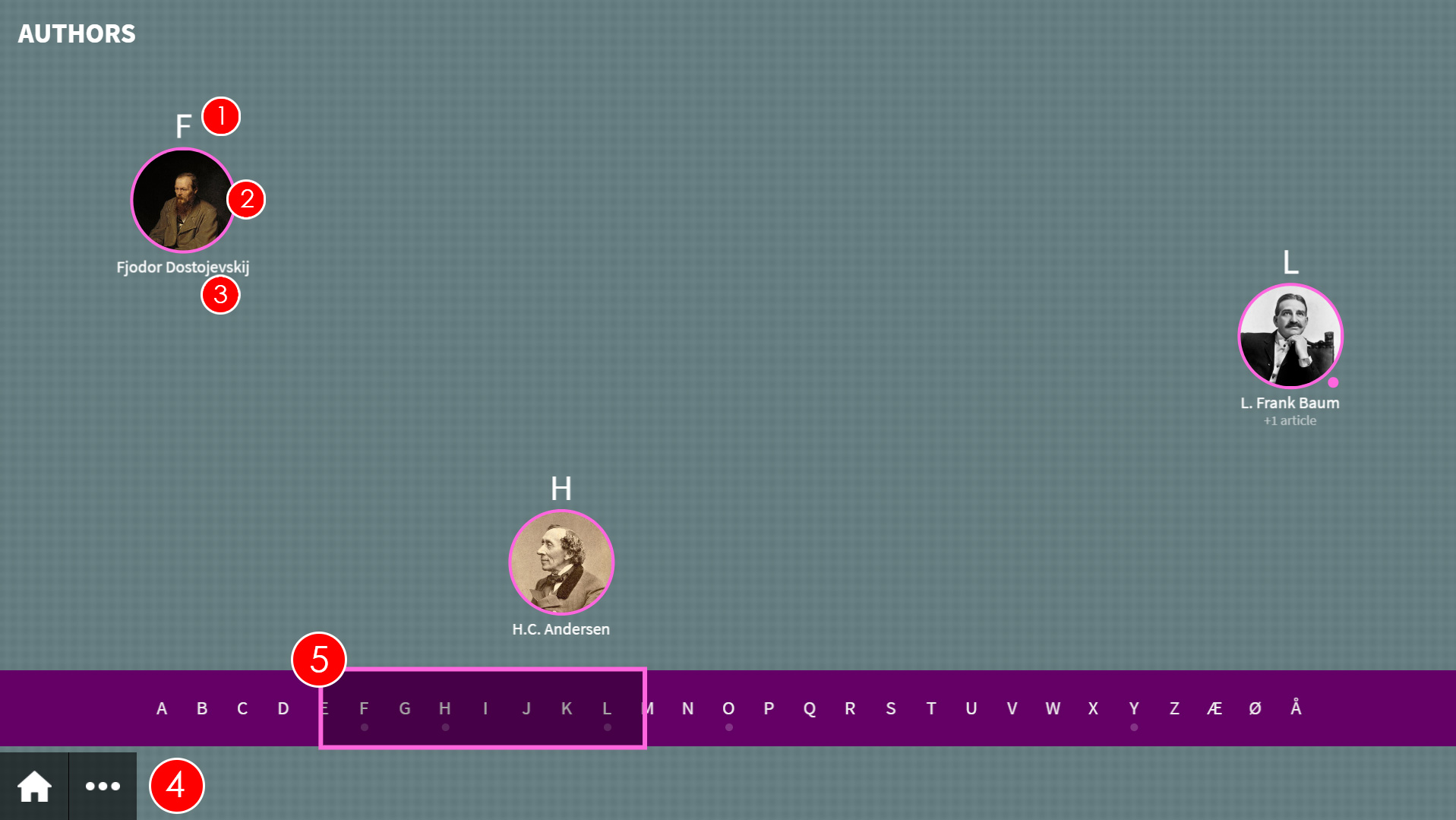
- Categorising letter - The letter that is used to place the article at a position on the ABC line. The categorising letter can either be the first letter of the article title or another specified letter. For example, if you have multiple articles that start with the word "The" (which would all appear under T by default), you may wish to set the first letter in the second word to be the categorising letter.
- Icon - The icon is an image that has been associated with the article that appears on the ABC line to show the articles position. If there is more than one article for a specific letter, the icon will cycle through the images for all associated articles.
- Title - The title of the article. If there is more than one article for a specific letter, the title will cycle through the titles for all associated articles, and you will see text below the title showing how many additional articles are associated.
- Home / Siblings - Selecting the Home icon will take the patron back to the main screen, where they can pick between the root items attached to the uniFi+activ. The (...) button vil open a selection of sibling presentations/widgets attached to the same collection.
- ABC line - The ABC line runs from A to Z (with the inclusion of some special characters at the end). The patron can press anywhere on the ABC line or scroll it to see the articles associated with the letters in that part of the line.
-
5.6.1
Creating an "ABC line"
To create an ABC-line presentation:
- Select Presentations from the options on the Main screen.

- Select + Add Presentation and choose the ABC line presentation.
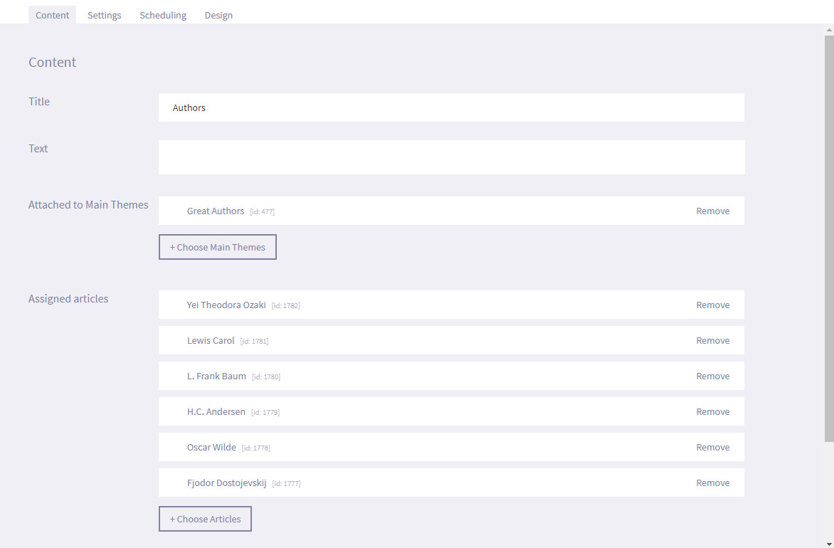
- Under the Content tab, enter the Title of the presentation and Text. These are not displayed on screen.
- Select Save and Publish (or Save as draft if the presentation is not ready to publish).
- Select the + Choose Articles to link articles to the ABC line.
- Under the Settings tab, you can assign tags to presentation so that it is easier to search for later. For example, if the presentation is part of your Roman collection, you can enter a tag such as Rome on all articles and presentations that should be included, or you could also enter a tag such as Julius Caesar so that you can quickly search for a specific subject. You can add multiple tags to a presentation or article.
- Under the Design tab, select Choose File and navigate to an image on your computer to use the selected image as a Background for your timeline.
If you are using multiple timeline presentations to create one long timeline, consider creating one large image and dividing it in to smaller images (one for each timeline). This way, it will look like the continuation of one timeline. - Select Save
- Select Presentations from the options on the Main screen.
- Basic
-
6.
Widgets
A Widget is an independent presentation that does not require articles to be attached. Every Widget type has a specialized purpose.
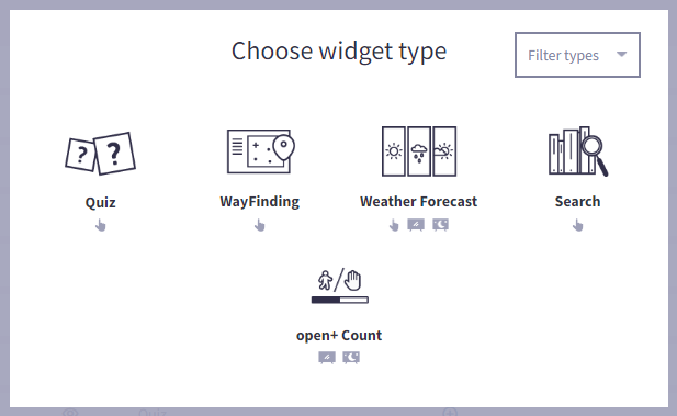
The different Widget types:
- Quiz (uniFi+activ only)
Create and display an engaging quiz for your visitors. - Wayfinding (uniFi+activ only)
Displays a map of the library with searchable icons to help patrons navigate the building. Articles can also be attached to locations. - Weather Forecast
Displays the weather forecast for the next 7 days for a configurable location. Works equally on display, idle and activ. - Search(BETA) (uniFi+activ only)
Allow patrons to use keywords or phrases to search through a third party application (such as an LMS / ILS) and display the results on screen, including any additional information on the item held on the application. Integration is only available for select third party applications and all configuration and association to the library account must be completed by bibliotheca. - open+ Count
An add-on to the Bibliotheca open+. Monitoring the capacity vs current occupancy of the public space.
-
6.1
Weather Forecast
The Weather Forecast widget is used to display the weather forecast for the next 5 days for a configured location.
The widget will display the temperature, wind speed and rain fall, in addition to a pictoral image of the weather (Sunny, Cloudy, Snowing, Raining, Stormy etc.).
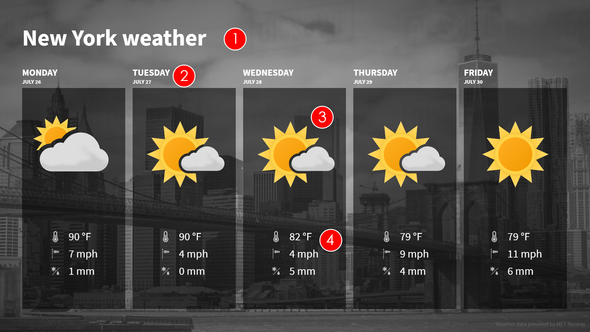
- Title of weather forecast - A good practice is writing the location that the weather refers to.
- Date - This is the date that the forecast is for
- Weather Symbol - This is a visual representation of the general weather forecast for the specified day. For example, a picture of a white cloud with the sun appearing above it would generally point to a sunny day with some cloud.
- Weather specifications:
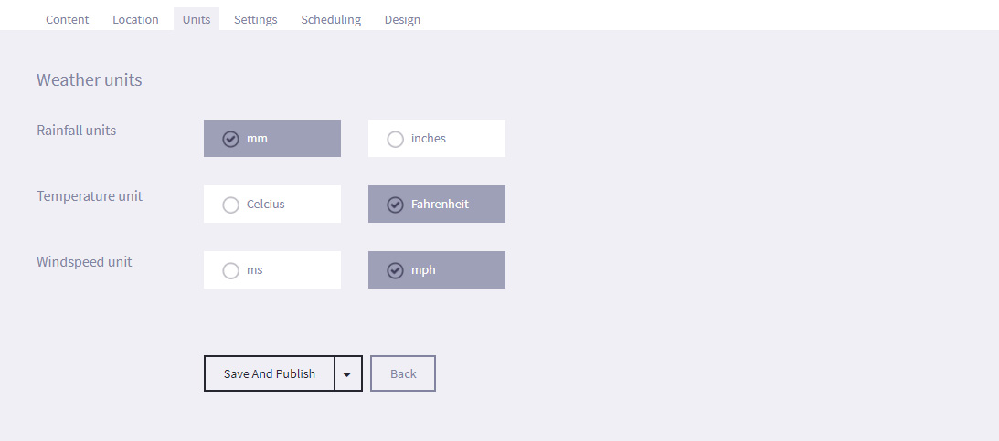
Temperature - This is the average temperature forecasted for the day (in Celsius or Fahrenheit).
Wind speed - This is the wind speed forecasted for the day (in metres per second or mph).
Percipitation - This is the overall amount of percipitation (Rain, Snow, Sleet or Hail) forecasted for the day (in millimetres or inches).
-
6.1.1
Creating a Weather Forecast
To create a Weather Forecast widget:
- Select Widgets from the options on the Main screen.

- Select + Add Widget and choose the Weather Forecast.
- Under the Content tab, enter the Title and Text.
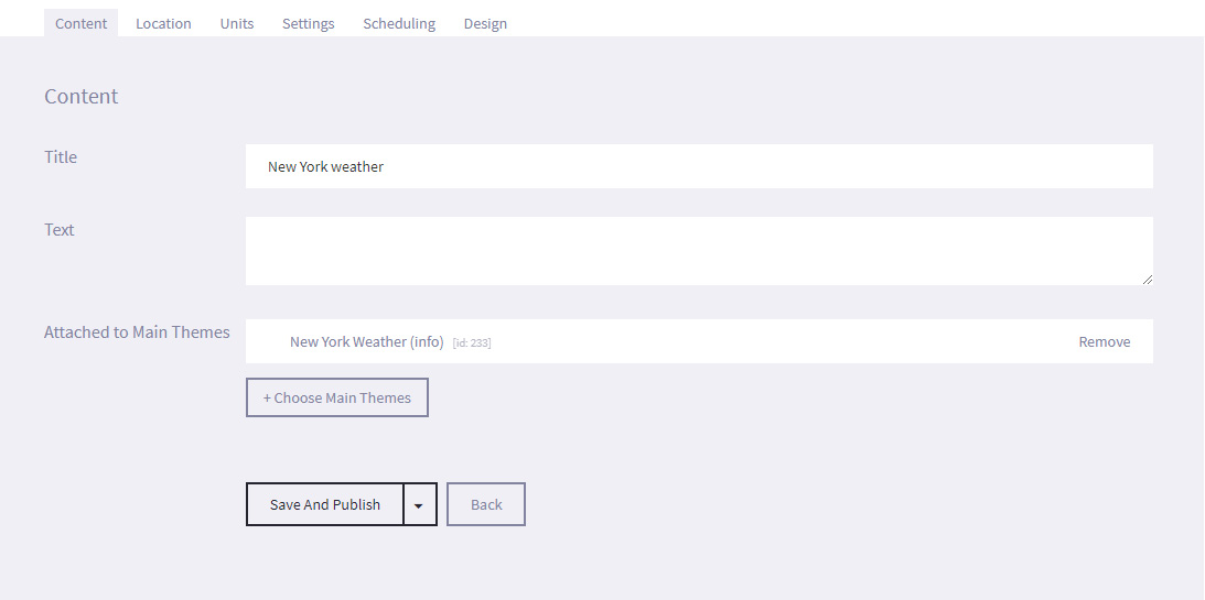
- Under the Location tab, enter the City name and Country of the location that you want a forecast for.
Select Find Current Location if you want the forecast for the location you are currently in, or Find Coordinates if you want the forecast for the location that you have entered in the City name field.
Selecting either will display a map in the Location Chosen field, with a pin drop marker specifying the exact location. If you know the exact coordinates, you can manually enter the Longitude and Latitude.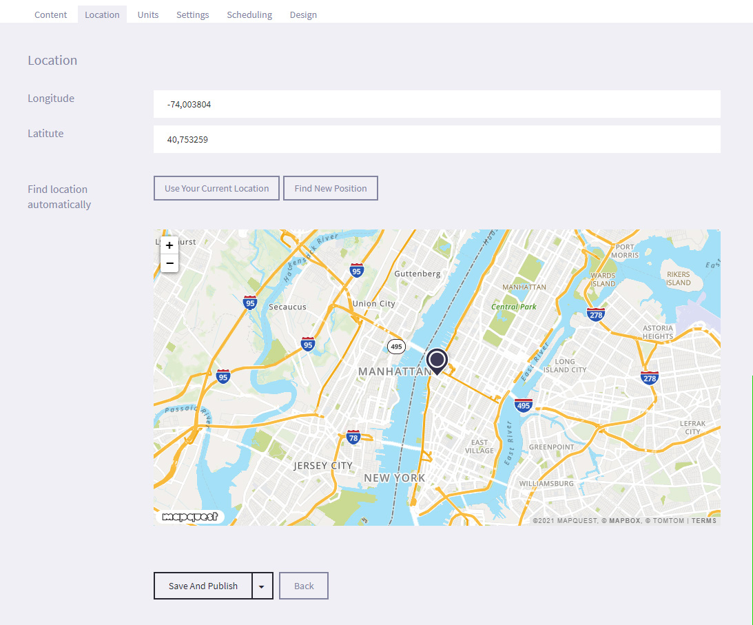
- The unit tab lets you decide what units you want your weather specifications displayed in.
- Under the Settings tab, you can set a time limit for the specific dates and times that the widget will be displayed by selecting Active time limit and entering the required Start and End dates and times.
- Additionally, you can assign tags to widget so that it is easier to search for later. For example, if the widget is part of your Roman collection, you can enter a tag such as Rome on all articles, presentations and widgets that should be included.
- Under the Design tab, select Choose File and navigate to the location of the image to use as a background image. l We recommend a resolution of 1920 x 1080 pixel for applications in landscape view.
- Select Save and Publish (or Save as draft if not ready to publish).
- Select Widgets from the options on the Main screen.
-
6.2
Wayfinding
(+activ and activ directed only)
The wayfinding widget is used to help patrons navigate the library, showing the location of facilities and materials. Articles can also be attached to give more information, and can include images of the location.
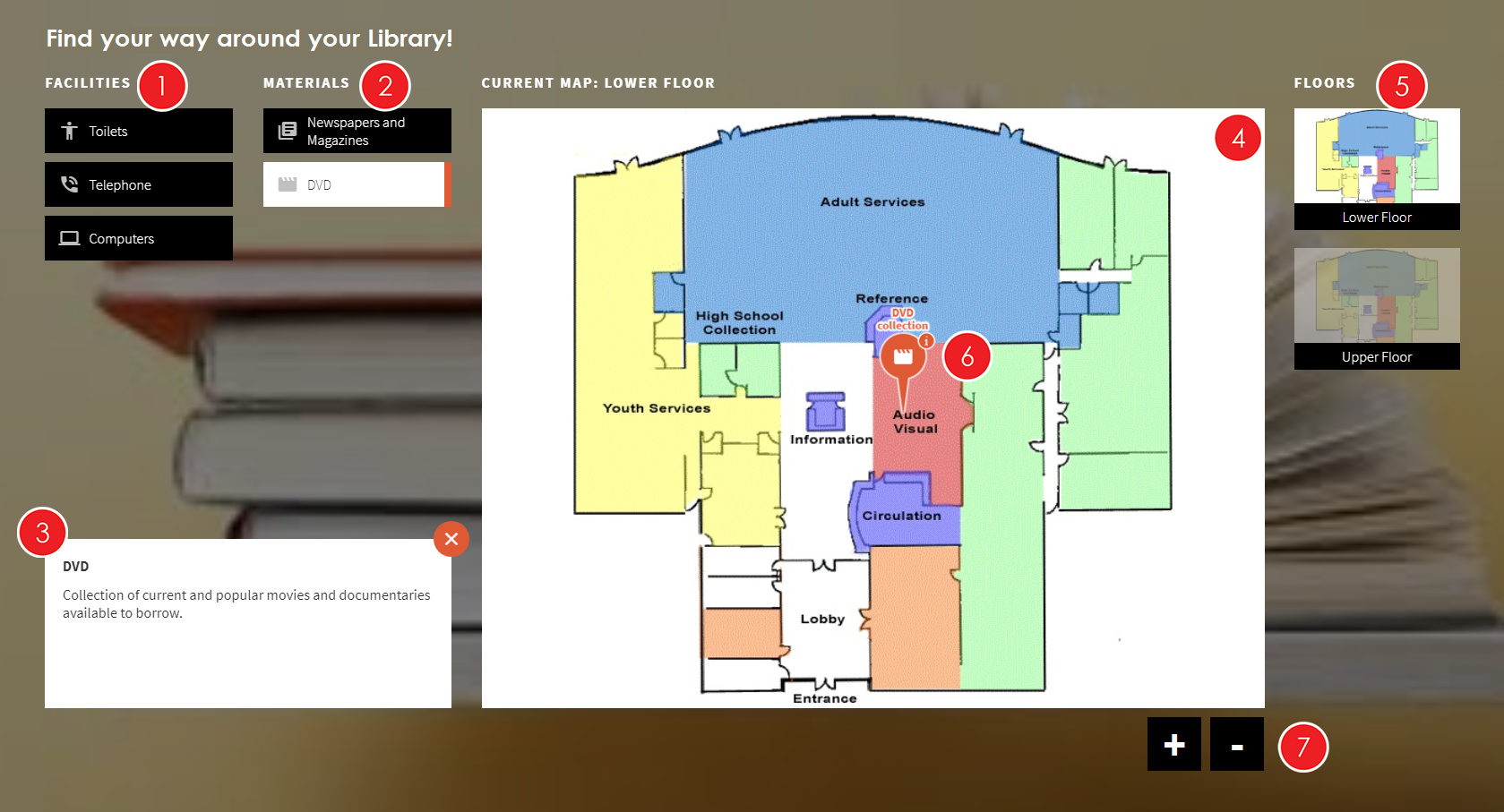
- Facilities list - A list of the Facilities in the library (Toilets, Telephones, Computers etc.). Tags are set up in the Wayfinding section.
- Materials list - A list of the Materials in the library (Newspapers and Magazines, DVDs, Periodicals and Journals etc.). Tags are set up in the Wayfinding section.
- Tag Description - A brief description of the selected tag. For example, you may want to let patrons know that there is a set fee for borrowing DVDs and CDs.
- Current Map - This is the current map that the patron can interact with. The title above (i.e. Lower Floor) is configurable, and should inform the patron of the location.
- Floors - If more than one map has been created in Wayfinding, all the maps will be shown in a list of smaller images by the side of the Current map. The current map will be highlighted in the list, with the other maps appearing slightly transparent. To view a map, the patron just needs to select one of the transparent maps. The selected map will then become the current map.
- Tag location - A pin will indicate any locations on the current map that have been tagged as having the selected facilities or materials. If the pin also has an "i" on it, it has an associated article that can be viewed by pressing the pin.
- Zoom - Patrons can use the "+" and "-" buttons to zoom in and out of the image.
-
6.2.1
Creating Wayfinding maps
To create the wayfinding maps:
- Select Wayfinding in the main menu


- Under the Maps tab, select + Create New Map
- Select Choose File and browse to the location on your computer that stores the map image that you wish to use.
- Enter the title for the map in the Title field. This should be the location (such as Lower Floor or Upper Floor), as this text is displayed on screen.
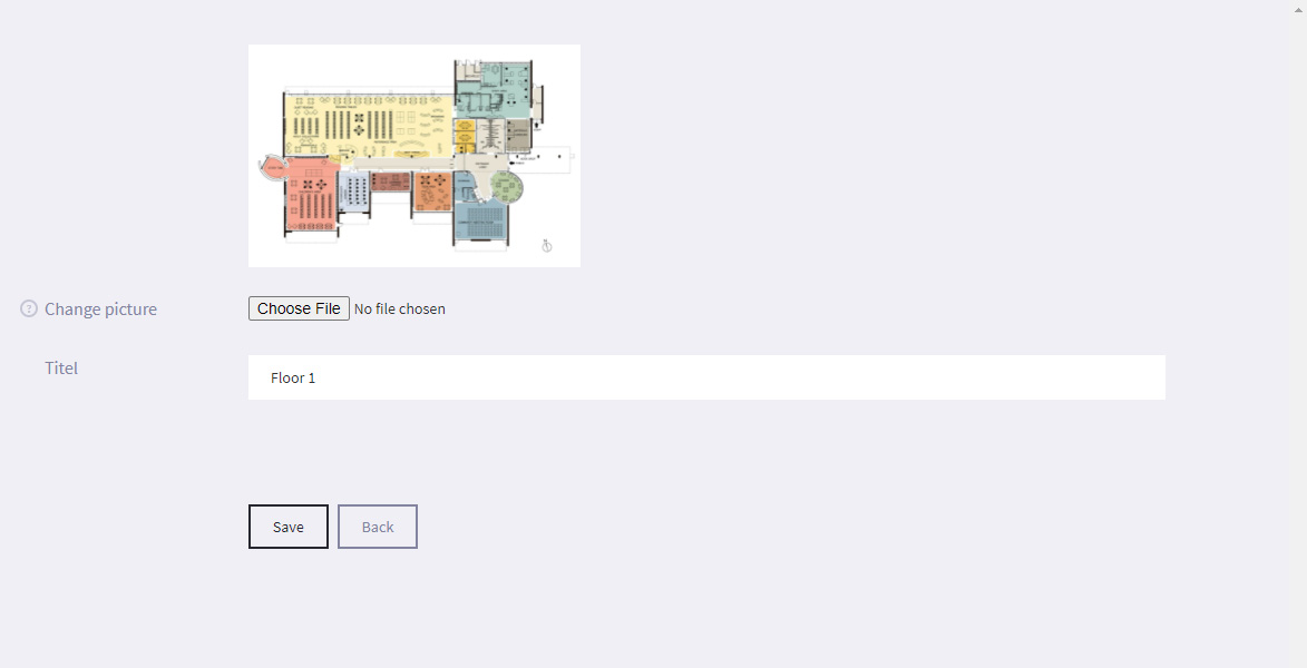
- Select Save
- Under the Tags tab, select + Create New Tag
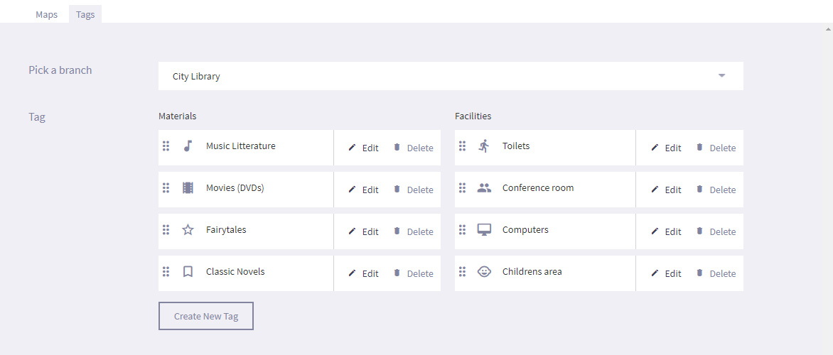
- Enter the Title for the tag (e.g. Telephones) and the Tag Description.
- Select the Tag type from the Categories drop down menu (Facilities or Materials).
- Select Add Icon and choose a relevant icon from the available icon to be displayed on the pin.
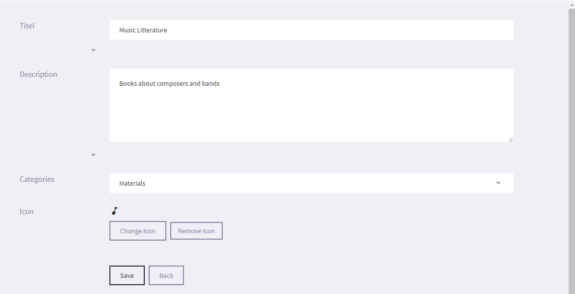
- Select Save
- Return to the Maps tab and select Edit areas next to the map that you want to edit.
- Select Draw area, Draw rectangle or Insert point and specify the areas on the map that you want to add tags to.
- Select Insert screen to specify the location of the uniFi+activ screen. - Enter the Title for the area (e.g. History section, DVD collection).
- Use the Tags drop down menu to select any tags that you want to assign to the area.
- If required, select Add Article and assign an article that can be viewed by the patron when they touch the tag pin.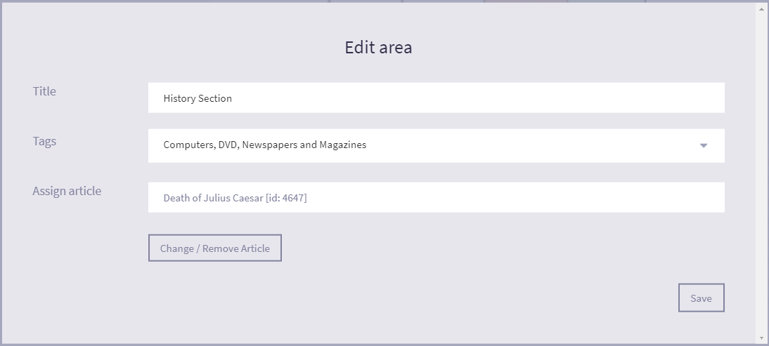
- Select Save on both the Edit Area and Wayfinding screens.
- Select Wayfinding in the main menu
-
6.2.2
Creating a "Wayfinding" widget
To create a Wayfinding widget:
- Select Widgets from the options on the Main screen.

- Select + Add Widget and choose the Wayfinding widget
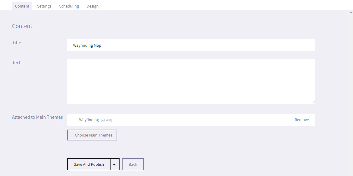
- Under the Content tab, enter the Title of the widget and Text. These are not displayed on screen.
- Under the Settings tab, you can assign tags to widget so that it is easier to search for later. For example, if the widget is part of your Roman collection, you can enter a tag such as Rome on all articles, presentations and widgets that should be included, or you could also enter a tag such as Julius Caesar so that you can quickly search for a specific subject. You can add multiple tags to a widget, presentation or article.
- Under the Scheduling tab, you can set a time limit for the specific dates and times that the widget will be displayed by selecting Active time limit and entering the required Start and End dates and times.
- Select Save. You do not need to link any articles to the widget. It automatically uses all of the maps set up in the Wayfinding section.
- Select Widgets from the options on the Main screen.
-
6.3
Search (BETA)
(+activ and Danish customers only)
The Search widget allows a patron to search an entire LMS / ILS database (which can only be associated to your account by bibliotheca) for results, and is similar to the Digital Bookshelf presentation except that it does not limit the results to subjects set by the library.
-
6.3.1
Creating a Search widget
Although you can create a Search widget, the third party application (LMS / ILS) can only be associated to your account by bibliotheca.
If it is not, no results will be displayed on screen and you will see an error message.To create a Search widget:
- Select Widgets from the options on the Main screen.

- Select + Add Widget and choose Search.
- You will see the Edit screen. Under the Content tab, enter the Title (which will be displayed on screen) and optional Text (which is not displayed on screen).
- Select Save and Publish (or Save as draft if not ready to publish).
- Attach the widget to a Screen (or a Collection and make sure that Collection is enabled on the required screen or screens).
- Select Widgets from the options on the Main screen.
-
6.3.2
Using the Search widget on screen
To use the Search widget:
- Press the Main Menu tile that the Search widget is associated to on the screen.
- Use the onscreen keyboard to enter a keyword or phrase that you would like to use to filter the results from the LMS / ILS (for example, a subject - Ancient Rome, an author - J.K.Rowling, or a title - Game of Thrones) in to the Search bar.
- As you enter the keyword or phrase, you will see search suggestions displayed under the Search bar. For example, if you enter the keywords "Harry Potter" in to the Search bar, you will see the titles of the Harry Potter books displayed as search options. Pressing one of these options will take you to the results for that specific keyword or phrase.
- Press on the Magnifying Glass icon to search for results based on the keyword or phrase entered in the Search bar.
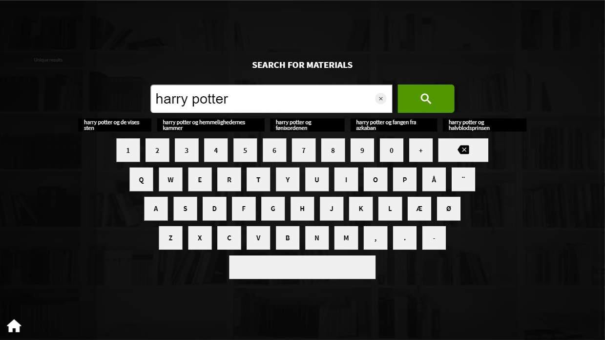
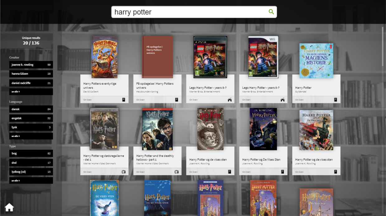
- The next screen will display all the results that the LMS / ILS can find relating to your keyword or phrase, using the cover art as a tile, if available.
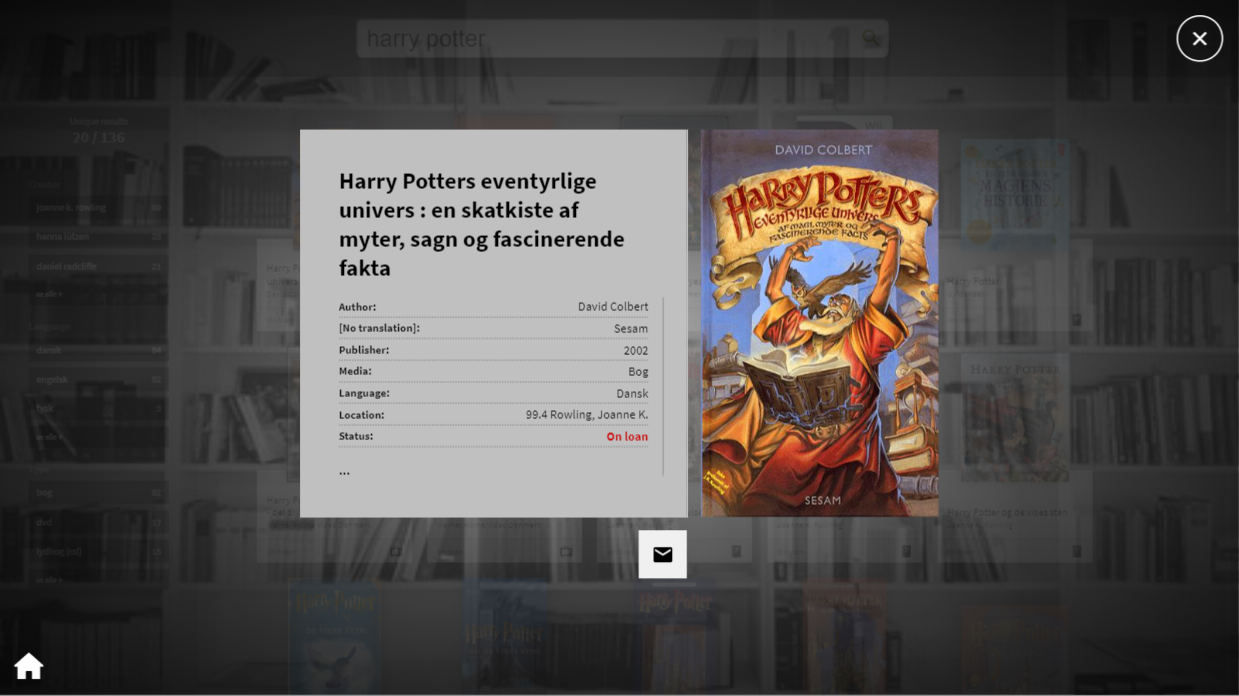
- Press on the cover art of a title to see the information that the LMS / ILS has for that title (such as author, publisher, library location and current circulation status etc.)
- Select the Cross icon in the top right corner of the screen to return to the results page.
- Select the Envelope icon to send the information to an e-mail address of your choosing, which you will be required to enter using an onscreen keyboard.
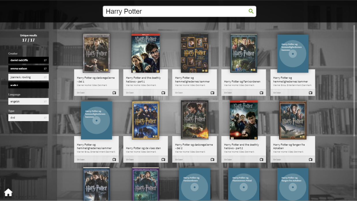
- You can use the additional filter options in the column to the left of the screen to further filter the results by Author (or key person), Language and / or Media Type. Selected filters will be highlighted in white. In the example below, you will see that the results have been filtered to only show English language DVDs that relate to J.K. Rowling.
-
6.3.1
-
6.4
Quiz
(+activs only)
A quiz is a widget which can engage users at your library. Below is an illustration and explanation of how a quiz is presented on the +activ. Afterwards a detailed guide on how to create a quiz is presented.
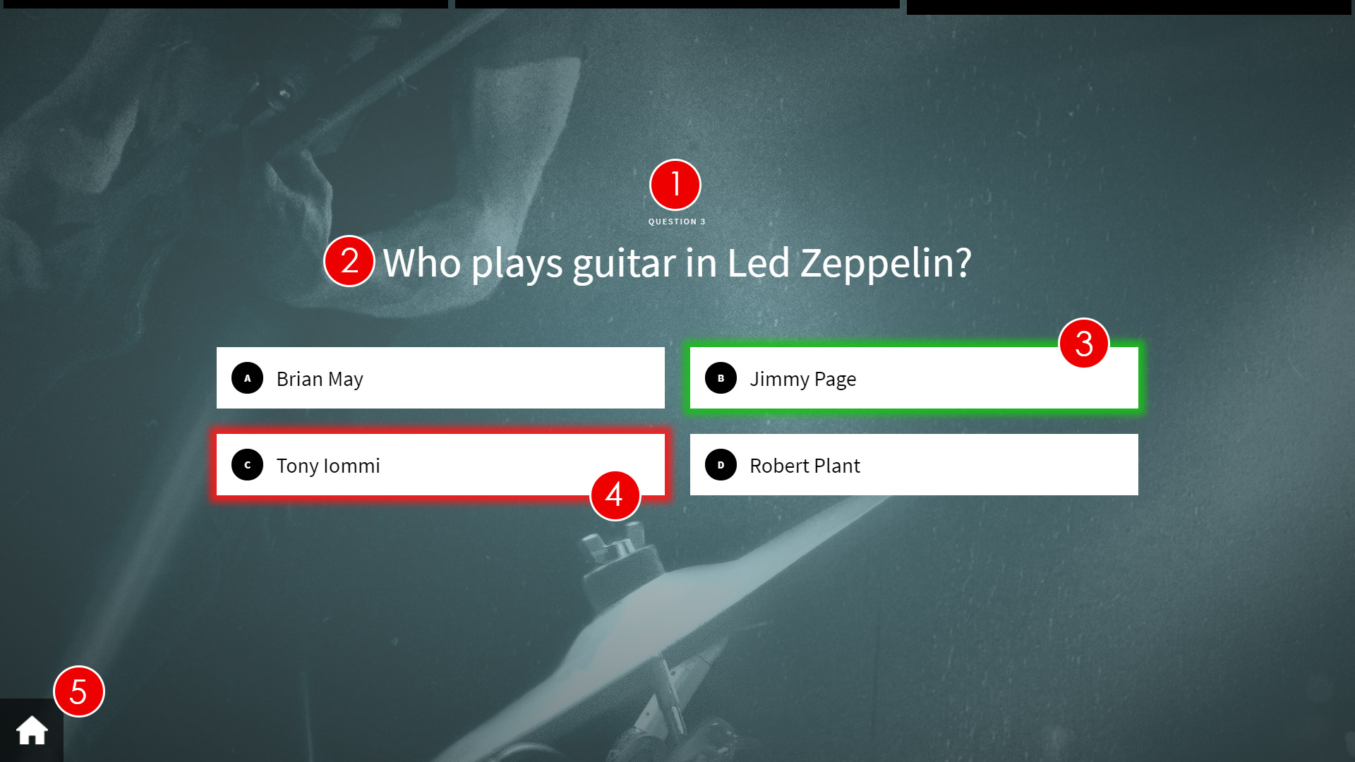
- Question number - Shows the current question number in the quiz.
- Question - This is the question that is being asked.
- Correct answer - The correct answer will be highlighted green whether the patron selects it or not. The highlighting of answers occurs after the patron chooses their answer.
- Selected incorrect answer - If the patron chooses an incorrect answer, the selected answer will be displayed highlighted red.
- Home - Selecting the Home icon will take the patron back to the main screen, where they can pick between the root content items of the uniFi+activ.
You can also add a background to the quiz. The background is the same for all questions, and you should also consider whether the colours of the background will contrast, obscure or take focus from the question text.
-
6.4.1
Creating a Quiz
To create a Quiz widget:
- Select Widgets from the options on the Main screen.

- Select + Add Widget and choose Quiz.
- Under the Content tab, enter the Title for your Quiz. This is used to name your Quiz in the administration and will not be shown on the screen.
- Select the +activ the Quiz will be shown on. This can always be done later in the process.
- Select Save as draft
- Go to the Question tab, start by clicking + Create New Question
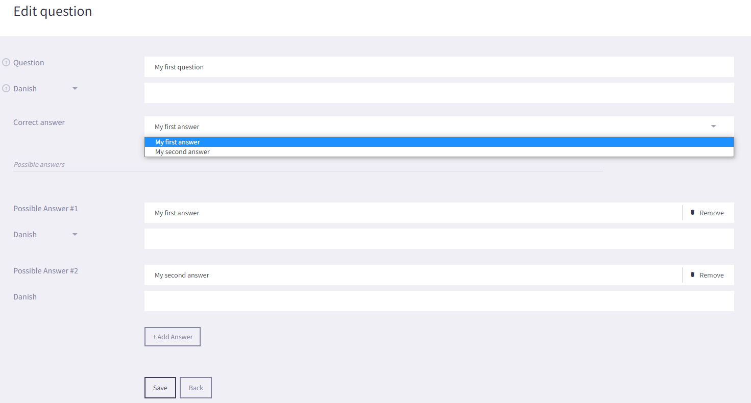
- You will be redirected to the 'Edit question' page. To create a question for your Quiz you will need to:
- Write your Question. This is the title of your question which will be shown on the screen. For multi language support translate the question to your desired languages.
- Select + Add Answer to add answers to your question. We recommend creating up to 4 possible answers per question. For multi language support translate the answer to your desired languages.
- Select the 'Correct answer' from the drop-down list. You should try and make sure that the correct answer is not in the same position for each question (e.g. the correct answer is not always Possible Answer #1).
- Click on Save to save your question, then click on Back to start adding more questions to your Quiz
- Saved questions will be shown in a list under the Questions tab. From the list view you can:
- Click on the question title or the edit button to go to the edit page of the specific question.
- Click delete to delete a question in the quiz.
- Change the order of the questions shown in the quiz on +activ by dragging and dropping the list items to the desired position. The top question in the list is the first question shown on the +activ and so forth. Remember to click Save as draft or Save and Publish to save the rearranged order of questions.


- Under the Scheduling tab, you can set a time limit for the specific dates and times that the Quiz will be displayed by selecting 'Active time limit' and entering the required Start and End dates and times. By selecting 'Activate repetitions' you can set a specific time and days in which your Quiz is shown on the screen.
- Under the Styling tab, you can choose an alternative Style Theme for your Quiz. You can create a custom background for your quiz by selecting 'Use custom image'. To set a custom background for your quiz select Choose File and navigate to the location of the image to use as a background image.
We recommend a resolution of 1920 x 1080 pixel for applications in landscape view. -
Add your Quiz to your uniFi+activ screen. You can do this from within the Quiz or in the Screen section:
In the Quiz:
- Under the Content tab click + Choose Screens , select your uniFi+activ screen and click Save
- Remember to click Save as draft or Save and Publish to save the coupling to the screen.
In the Screens section:
- Select Screens from the options on the Main screen.

- Click on
 in the content column of the screen list, go to the Widgets tab, select your Quiz and click Save
- When you've made all your desired configurations for your Quiz, select Save and Publish under the Content tab to publish your Quiz to your selected +activ.
- Great job! You've now created your first Quiz.
- To see how are your Quiz is presented on the uniFi+activ screen, go to the Screens section and click
 next to the screen you added your Quiz to.
- Select Widgets from the options on the Main screen.
- Quiz (uniFi+activ only)
-
7.
Collection
A Collection (formerly "Main Theme") is, as the name suggests, a collection of content.
Collections come in two different types. One for interactive themes - for use on activ screens, and one for non-interactive themes only - for use on display and idle.
Note: Themes like Basic, Bookshelfs and Calendars work on both interactive and non-interactive screens, and therefore they can be attached to both Collection Types.
New in version 1.10
Unlike before, it is no longer necessary to pack content in a collection to make a button on the activs main menu.
Now presentations, widgets and articles can be attached directly to a screen. The same goes for +display and +idle.However, the collection is still relevant and has different uses on activ and display, respectively:
active - collection
A collection on +activ makes a button on the main menu. Pressing this button will open the first presentation/widget of the collection. A "more" button with three dots [...] now appears at the bottom of the screen. From here you can open a list of all the themes in the collection.
With other words, an active-collection provides an opportunity to have an overall collection with multiple presentations/widgets.
An example could be creating "The Roman Empire" as a collection and then include a timeline, a map, an article collection and a quiz, as presentations that each tell the story in their own way.
For a activ with many presentations/widgets, using collections can be a way to save space on the main menu.
display - collection
For +display and +idle, collection is a way to create a larger content package with different themes. This makes it easier to attach the same content to multiple screens.
An example: Three presentations must all be attached to five +display screens:
Option 1 (without theme collection): presentation_A, presentation_B and presentation_C are each connected to the five screens (15 attachments)
Option 2 (with collection): presentation_A, presentation_B and presentation_C are connected to one collection and then the collection is connected to the five screens (8 attachments).
The display of the content will be the same, but in option 2 there are fewer attachments to be done, and it is faster to add or remove themes across all five screens.
-
7.1
Creating a Collection
To create a Collection:
- Select Collection from the options on the Main screen.


- Select + Create A New Collection
You will be asked to choose between an Active (for interactive uniFi+activ screens) or a Display (for uniFi+display and +idle) before you are taken to the edit screen.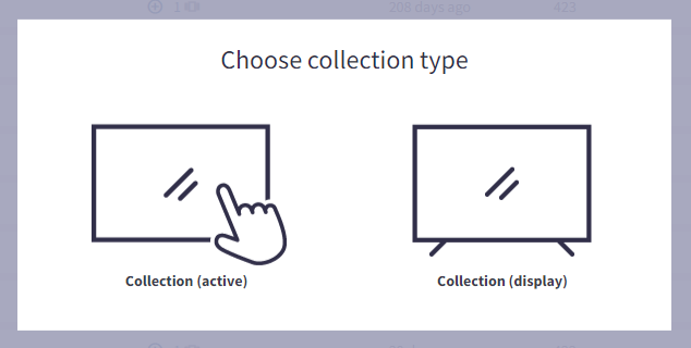
- On the Edit screen, configure the following settings on the Content tab:
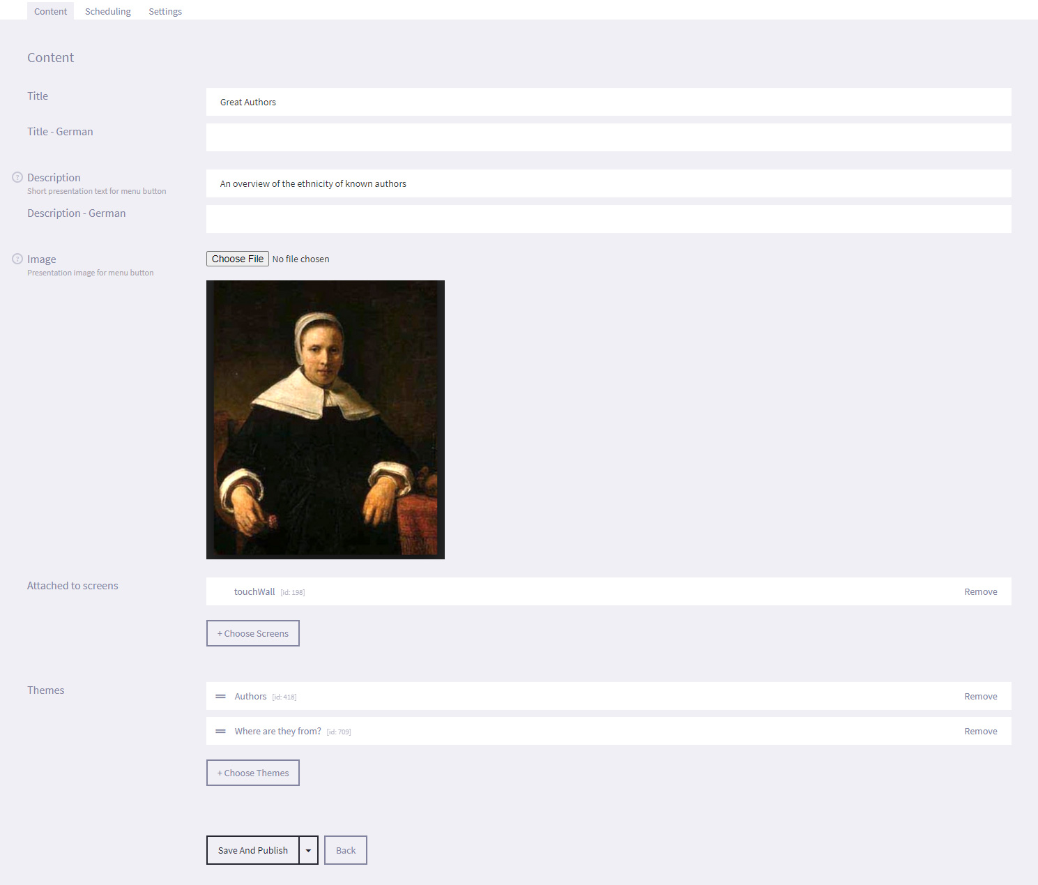
- Title - The title of the Collection. This is mandatory, but will only be displayed on uniFi+activ, in the main menu button tile.
- Description - The description is a "+activ-only" property, that will be displayed on the button in the main menu. It's recommended to keep it below 100 characters and use it to describe the content.
- Image - The image is also a "+activ-only" property, that is displayed on the main menu button for the Collection.
- Attached to Screens - From here you can choose which screens that should have this Collection attached.
Click + Choose Screens to add or remove screens via the content picker.
When screens are added they appear in a list above the button. Here you can remove them directly if needed. - Presentations / widgets - You can see the children that are already attached to this Collection, and select Remove to detach the entity.
You can reorder the associated presentation/widget children so that the entity at the top of the list is displayed as default when the relevant Collection is selected on screen. Simply hover over the required entity, until you see a hand icon, and drag the entity up or down in the list in to the order required. - To add and remove Presentations or Widgets you can use the content picker by firstly clicking the + Choose Presentations or + Choose Widgets button and then checking or unchecking the entity ind the picker window.
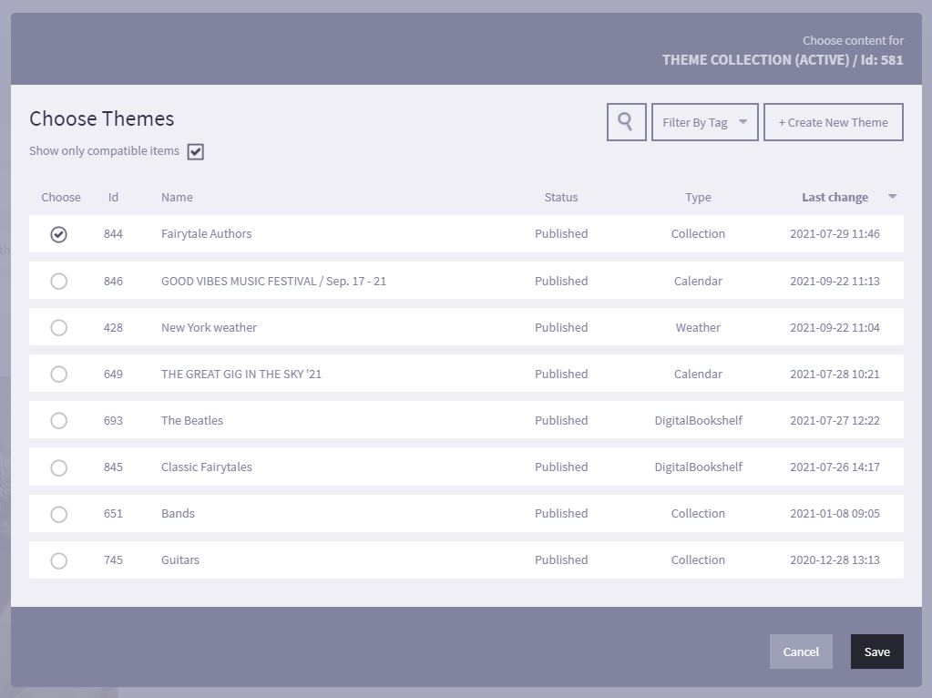
Important: A Collection without any children attached will not be shown despite the Collections is attached to a screen.
- Configure optional time limitations for the Collection on the Scheduling tab:
Time limit - Choose a time period that the Collection will be displayed between. This is ideal for content set around events such as Christmas or a Sporting event, for example.
Repetitions - Choose the exact weekdays and time the Collection will be active in.
In this example above the Collection will be active from July 7 to September 5 (including), 2021, each day between 10:00 and 14:00 and not on weekends.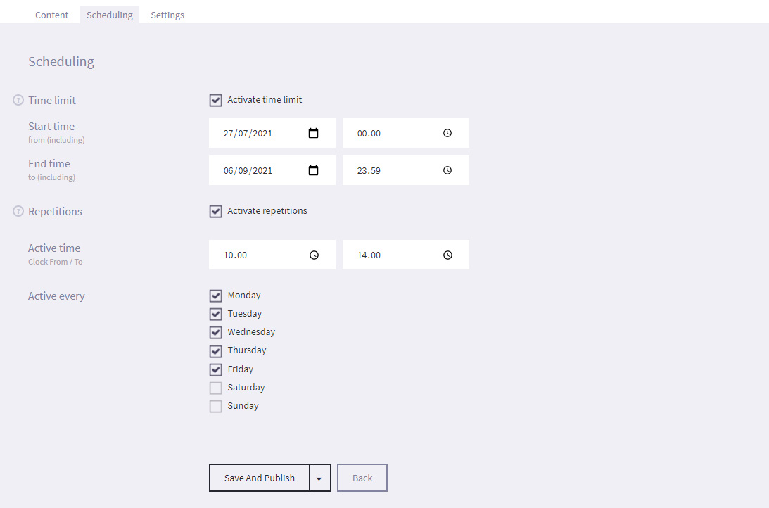
- Select Save and Publish (or Save as draft if not ready to publish).
- Select Collection from the options on the Main screen.
-
7.1
-
8.
Screens
You can configure each screen to look unique and display different content. This is especially useful in libraries where you have multiple screens as you can set the screen in the Children's area to show articles that appeal to a younger audience whilst another screen can cater to adult patrons.
-
8.1
Configure a screen
To configure a screen (Content, settings, design and logos):
- Log in to the uniFi+Administration module.
- Select Screens from the options on the Main screen.

- Select the Name of the required screen, under the Screen column.
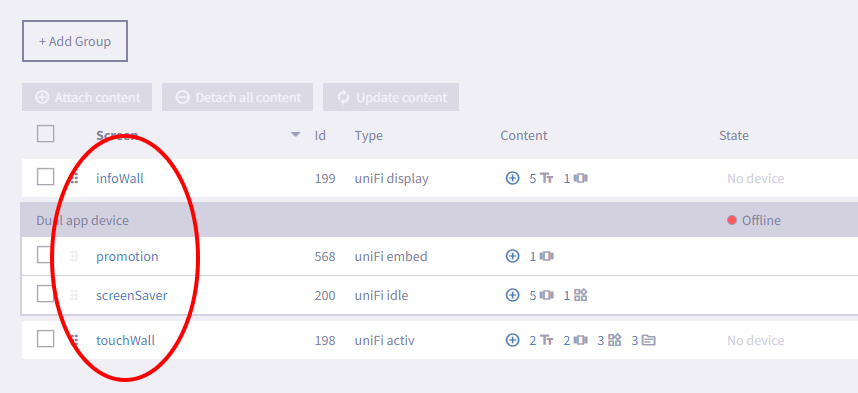
- Under the Content tab, add any content type by clicking + Add Collections, + Add Presentations, + Add Widgets or + Add Article and in the content picker modal check the items that you want displayed on the screen. If you select more than 5, some content entities can only be accessed by selecting the "More Content.." tile on the +activ screen.
For an +activ device, you can also select a (display) collection to act as an +idle. The +idle will be displayed if the +activ has not be interacted with for a specific amount of time. You cannot interact with the +idle, but pressing the screen will cause the +activ screen to be displayed again.
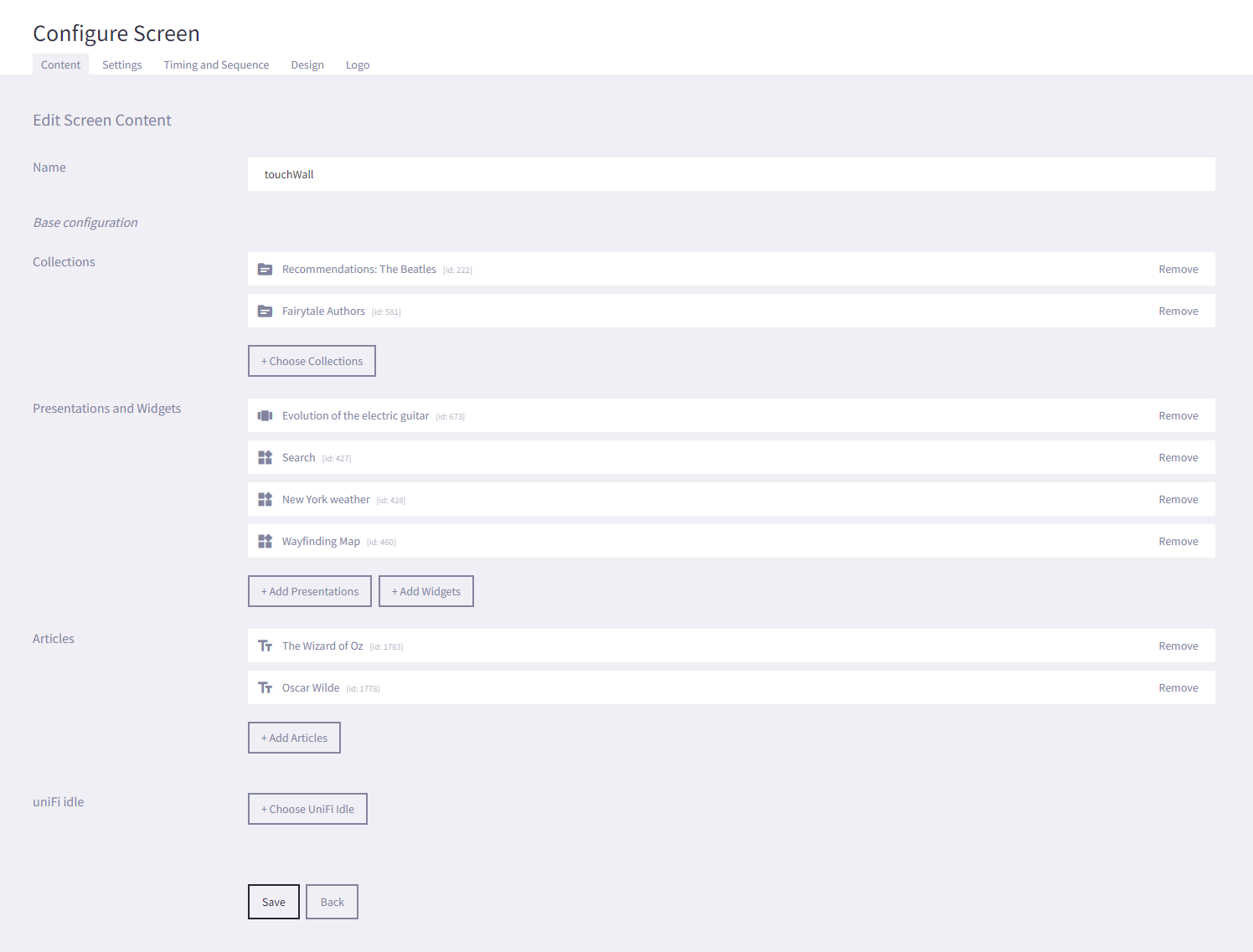
- Select Save.
- If configuring the screen for an +display or +idle, you can select the Settings tab and enable Show Time and Date to show the current time and date on the footer of the screen.
- Under the Styling tab, choose a Style Theme for the screen.
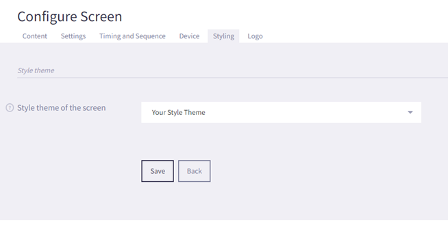
If you want to go further into designing your Style Theme, find a detailed guide here. - Select Save.
- Under the Logo tab, select Choose File next to the Primary logo field and browse to the location of an image on your PC that you want to use as the logo that appears in the bottom corner of the main screen.
You can use the Adjust Margins setting to set how far from the bottom right corner of the screen that the logo appears. You only have to adjust the bottom and right margins.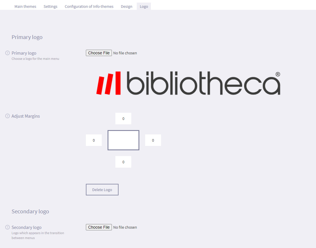
- Select Save.
- Select the Screens option to go back to the Screens page.
- Select Monitor icon under the Preview column to preview what the screens look like for the selected device.
The Main screen for a uniFi+activ preview will look similar to the image below:
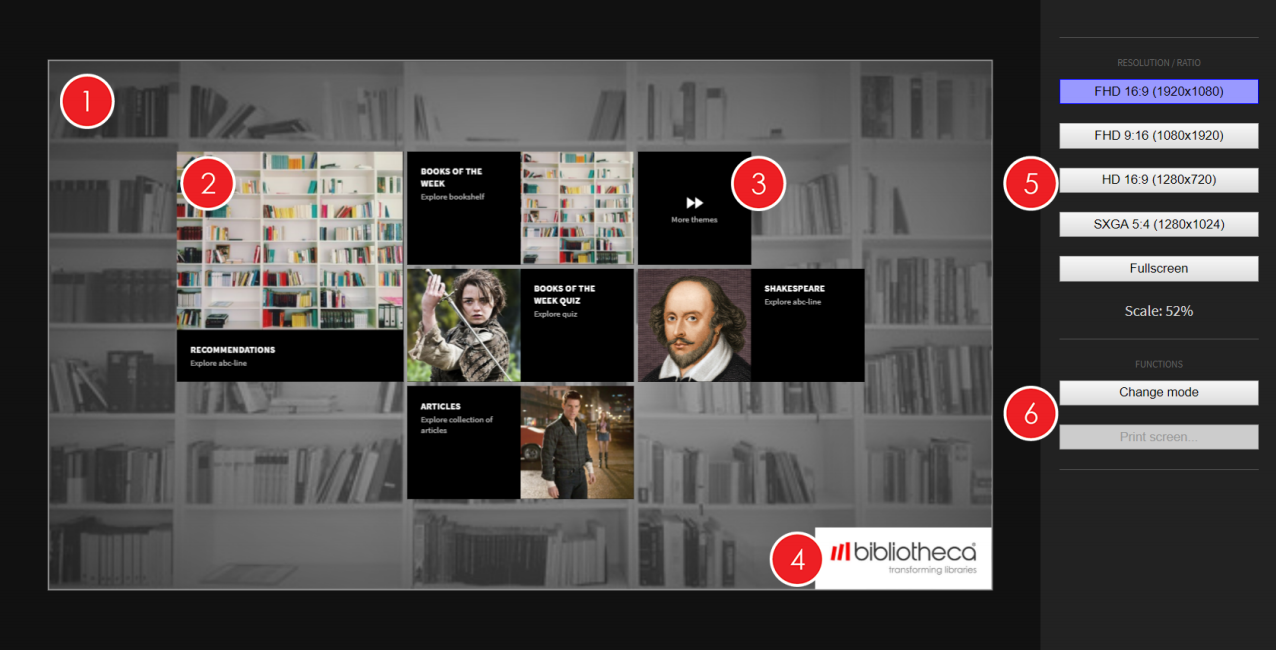
- Background - This is the image set as the background. In the example above, you can see that it has been configured to use the "light" colour scheme, set as light grey, which allows the background to contrast with the content tiles.
- Root content items - The menu is displaying alle attached root content, which can be any mix of Collections, Presentations, Widgets and Articles. The first five items enabled will be displayed as selectable tiles on the screen. Touching the tile will take you to the given Article, Presentation, Widget or the default child attached to a clicked Collection.
- More Content - If more than five root items have been enabled, selecting "More content.." will prompt the five first items displayed to change so that previously hidden items will replace some or all of them.
- Primary logo - This is the image set as the Primary logo, in the default location. If you adjust the margins, the location of the Primary logo will be displayed as set.
- Switch orientation - You can switch the orientation that you view the preview screen in, between landscape and portrait orientation, and different display sizes and resolutions.
- Change Mode - This drop down menu allows you to see what the screen will look like in each open+™ state (Staffed, unstaffed and closed). Only applicable where open+™ is installed in the library.
If you are viewing a +display or +idle screen, you will also get the opportunity to Print Screen. Read more about these features here.
-
8.2
Manually update the content displayed on a screen
If the +activ, +display or +idle device is online, you can manually "push" any updated content to the controller or PC. This means that you do not need to wait for the device to automatically restart at the configured time to refresh the content displayed on the live screen, allowing you to quickly and easily make changes. To manually update the content displayed on all screens:
- Log in to the uniFi+ Administration module.
- Select Screens from the options on the Main screen.
- Place a tick in the checkbox next to the Name of the required +activ, +display or +idle.
- If a device has new content that has not been applied to the controller or PC yet, the Content State column will tell you that it is Ready to Update. - If the device is online, you will see the Update Content button go from opaque to visible.
- Click on the Update Content button.
- Alternatively, if you only want to only update the content on a specific screen, select the Refresh icon under the Actions column next to the required screen. - The content will be "pushed" to the device and the new content will be displayed once downloaded.
-
8.3
Pair Device
To pair your device with your screen, please follow the steps below:
- Select Screens from the options menu in the Administration.

- Navigate to the Device tab.
- In this tab, you're able to connect your screen with the device which shows your uniFi+ content.
- To pair your screen with your device, simply input the Handshake ID displayed on your device and click the Pair button. Your screen content will now be loaded onto your device.
- To pair your screen with another device, click on the Unpair button and pair the screen again as described above.
If the Device tab isn't visible, and you wish to have this functionality enabled, please contact your uniFi+ service administrator or the Bibliotheca support team.
- Select Screens from the options menu in the Administration.
-
8.1
-
9.
Previewer
The previewer allows you to test the content on a specific screen.
In addition to screen format settings (HD, SD, vertical, etc.), the previewer has a number of features you can read more about below:
- Testing Open+ modes
- Printing a screen (+display and +idles)
- Time Machine (test scheduled and time dependant content)
-
9.1
Testing modes
If your uniFi+ screen has open+™ modes, the Change mode button will be active.
Pressing this will show a mode menu on top of the screen. Here you can test the screen content in the different states of the library.
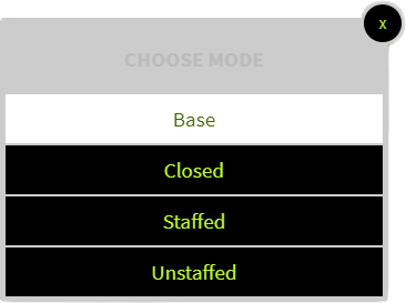
Read more about the open+™ integration here.
-
9.2
Printing a screen
You can print an article from the previewer. (+displayand +idles only)
When clicking Print screen... you will choose between portrait or landscape page setup. The layout of the screen content are now matched with A4 paper size in your chosen orientation.
If you need a larger paper size than A4, we advice you first to export it as PDF and then print this in the size you need.
Note: We can't guarantee at great image quality while it's depending on the uploaded image and processed for screen viewing. But texts are vector based and should always print nicely.When printing, any widgets and touch-advices are hidden by default. You can choose to bring them back by uncheking "Hide touch-advice & widgets".
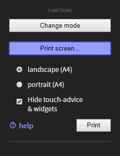
Click Print to open the print dialog. The preview screen freezes and the print is generated from it's current state. Are you looking to print a particular article, you must wait until it shows or skip articles by pressing [space] on your keyboard.
You can print the page directly or you can export it as PDF by choosing "Save as PDF" as desitination (This option may vary depending upon your Operating System).
https://helpx.adobe.com/dk/acrobat/using/print-to-pdf.html
If no PDF exports are available in your printer dialog you'll need to install a PDF-printer.
-
9.3
Time Machine


This feature is visible when some screen content is set to start and/or expire in the future.
It applies to both scheduled content using time limit and repetitions, as well as content with automatic expiration, such as calendar events.
Use the field to preview your content at future times.
NOTE: Future content is displayed based on what is currently is possible and what has been created at current time. Of course, future weather forecasts cannot be predicted and calendars will thin out the longer into the future you go, as events are created on an ongoing basis.
-
10.
Content Overview
Content Overview is a hierarchical tree of all your screens current content.
Click the Content Overview in the main menu

At first you'll see a list of all your screens. Click to expand any item (with an arrow marker) and its current content will unfold.
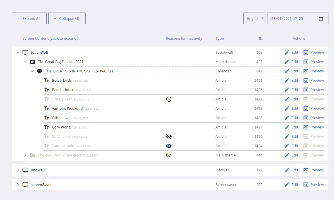
The attached content of the screen (collections, presentation/widgets and articles) are now shown in an indented list below - including currently inactive content. Inactive content items are greyed out and marked with an icon for each reason the particular item is inactive. See "Reasons for inactivity", below.
It is possible to navigate directly to the edit page for each item in all levels of the content tree. And for all active items you can preview the content directly by clicking the preview link.
-
10.1
Reasons for inactivity
There can be numerous reasons why your content does not show on screen. In this column you can see the exact reason(s) with each icon representing a reason for inactivity. Hover your cursor above the icon to get an explanation.
Here is an extended explanation of each icon:
 Not published - The content item is in draft mode. Solution: Go to the items edit page and choose Save and publish
 No titel - The content item has an empty title field in the selected language. Leaving the title empty is a way to exclude content in a specific language, e.g. until it has been fully translated. Solution: Type in the missing title in the desired language.
 No children attached or active - This applies to collections with no presentations/widgets (attached or active) and to presentations with no articles (attached or active). Solution: Attach child content. If content already attached - check why children are disabled.
 Parent item disabled - Solution: Check why parent presentation or collection is disabled.
 Expired or scheduled for later - This is caused by scheduling the content item. Solution: Under the Scheduling tab, change the Time limit or Repetition settings.
 Event is already held - The end-date of the event is before now or the selected time.
 Event is temporarily discarded - Due calendars amount- or day limitations. Solution: Under the calendars Calendar configuration tab, change or remove amount- or max-days-limitations
 Event location does not match calendars location limit - Only possible for internally created events. Solution: Reconsider calendars location limit or change the location of the event.
 -
10.2
Filters
By default the tree view is displaying its data status in your default language and in the current time.
You can use the filters in the top to change the language and time of view.

Selecting other languages
You can select any of the languages your uniFi+ applications support.
Selecting a different language will reveal which content is yet to be translated, as you may notice the icon appears on some (or many) of the content items.
Selecting a different time of view
Due to the many time dependant conditions a content item can be subject to, it is possible to view the content from any future time set.
Use the time selector to change the time of view and notice how scheduled items and calendar events change their state - due to their individual time limitations.
Tip: The time selector can be used by its drop down feature where you select a certain date. Or you can mark e.g. the date number and use arrow keys [up] [down] to change one day at the time.
Note: When clicking preview on an active content item, the current filtering is passed on to the previewer so you'll preview the content in that particular time and language.
-
10.1
-
11.
Style Themes
Style Themes define the main background image, the colors of most screen elements and texts, and optionally the logos for your screen.
Every screen hook up to a style theme. If no custom style theme has been created your screens will link to the default style theme.
The default style theme is named with your customer name and postfixed "default styles". This theme is non-deletable and works as the fallback theme if a screen links to a deleted custom theme.
-
11.1
The Style Theme Properties
Every style theme can be edited to your taste. Best practise is to have the most part of your screens linked up to the default theme, so that most screens appearances can be edited in one time and because screens may fallback to this.
Let's go through the properties of a style theme.
-
11.1.1
Style theme name
This is the theme's identifier. Useful names could be "[some branch]s theme", "The Chrismas theme", "Children's section theme".
-
11.1.2
Background
Background image (upload):
This is the main background used on screens linked to the style theme. If no image is uploaded the screen will use a simple default texture. Don't worry about the contrasts of your image. This can be smoothed out by color settings below.
Background image size:
Cover : resizes your background image just enough to fill out the screen, so no borders are shown, no matter the screens format.
Original (repeat) : use the image's original size and repeats it when necesary. This is great for using smaller repeating patterns.
For best results, when using "cover", the uploaded background size should be the same as the screens resolution. In most cases 1920 x 1080 pixels for horizontal screens, and 1080 x 1920 pixels for vertical screens.
Background colorize:
These controls lets you choose a color tone and set its intensity on your background image.

The intensity slider has two stages:
The first goes from natural (no color) to a full duotone overlay in the middle. The duotone effect changes the contrasts of your image to a gradient span between (almost)black and the chosen color.
The second stage incremently draws the dark color of the duotone closer to the chosen color, making it fully opaque at the end as the two colors become the same.
Use the colorizer to create a stylish effect to your background or to make any background texts stand out better.
To create a background with nothing but one color, pull the slider all the way to opaque
Text color on background
Both +active and +dsiplay screens has texts placed directly on the background. Use this to select a color that stand out from your background design.
-
11.1.3
Element / Button colors
Upon the background we have graphical elements and buttons on +display/idle and +activ screens respectively. Theese elements are usually styled by two colors and sometimes of three.
Element color
The default element/button color. A color that stands out from the background would be a good choice.
Element text color
The text color of the default button. Choose a color that has good contrast against the element color.
Element secondary text color
Used for additional text inside a button (usually the menu button on +activ screens). Also it makes another option for element color inversions (see below).
Color variants (invertions)
The colors here define the 'default' button/element color variant, which means you in some places have the options to invert the colors. For example in the article view of the +active screens (read more below). Also you can set the variant (inversion) of elements/buttons under the 'styling' tab for each presentation and widget.
-
11.1.4
Presentation image overlays
Sometimes texts are placed over presentation images. E.g. in calendars. Use theese color controls to make the text as readable as possible and even give the presentation images a stylish look.
Image overlay colorize
Works like the background colorize control. Choose a color tone and set the intensity of it. The intensity slider goes from no color, through a stylish duotone, and into a fully opaque color.
Text color (over image)
Choose the color of the texts placed over the images. This should be in a good contrast to the chosen images overlay color.
-
11.1.5
+display and +idle specific
Reduce background texture
If your background image has a lot of texture or contrasts, it may impair the readability of the article body text on +idle/+display screens. This control adds an extra color overlay on the background - in the same* color of your chosen background colorize. *The color is alted a little compared to the chosen background text color. A lighter text will result in a bit darker background overlay, and the other way around, to make the article text even more readable.
Touch Advice Background
Choose a colors for the background of your +idle screen's touch advice. One way could be to let it stand out from the rest of the screens colors. Another way is to let it blend in with you chosen styles. It's up to you.
Note: the content of the touch advice (text and icon) is always white. -
11.1.6
+activ article and keyboard colors
Article paper color
This set the so called paper color (text background) of the article module on +activ screens.
Article text color
The text color of the +activ article screens
Note: Paper and text color are also applied to the article list view when a choices of multiple articles are given.
Article button variation
This set the button colors variation of the of the buttons in the article module such as 'send to mail' and other. The colors themselves are set in the element/button colors above. This dropdown only selects which inversion of the colors you want for the particular buttons. The chosen color variation also applies to any on screen keyboard.
Default: The default colors as set
Inverted: Text color becomes element color and element color becomes text color
Inverted-secondary : Secondary text color becomes element color, and element color becomes text color
-
11.1.1
-
11.2
Add a new Style Theme to a screen
To create a new Style Theme:
- Select Style Themes from the options on the Main screen.

- Select + Add Style Theme to create a new style theme from scratch, or start with another Style Theme's style by clicking the copy button:

- Edit the Style Theme to match your desired design. In the Style Theme editor you can directly see your changes in the previewer field.
Read more about the different settings above in the section The Style Theme Properties - When you have made the desired configurations, select Save
- Select Style Themes from the options on the Main screen.
-
11.3
Presentation & Widget specific styles
You're able to change the design of each presentation and widget by overriding the style theme design choices you've made.
You do this in the Styling tab for the presenation or widget you wish to customize.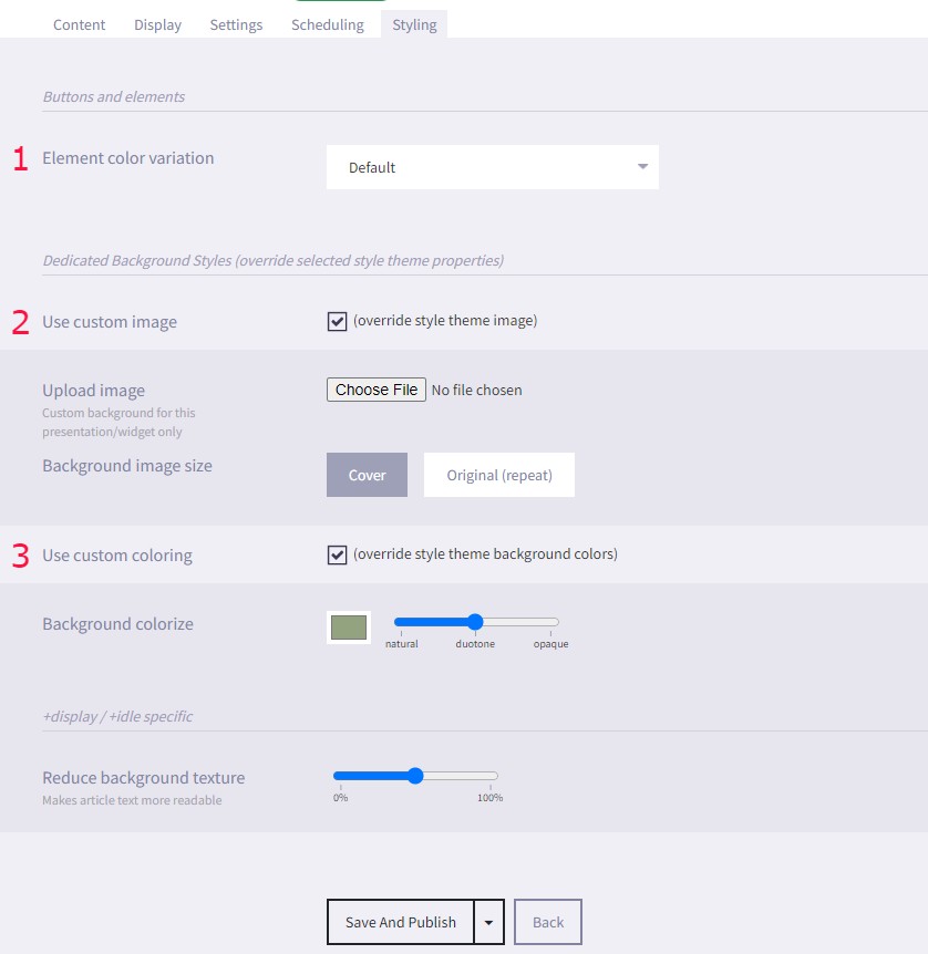
It's possible to override the following style theme design settings:- Element color variation changes the way colors are displayed for buttons and elements.
- Custom image gives you the option to change the background image for the presentation or widget you're editing.
- Custom coloring gives the option to edit the Background colorize and Reduce background texture.
When you've made your Styling changes, remember to click Save
-
11.1
-
12.
Settings
-
12.1
User
Awaiting Translation
-
12.1.1
Creating a new user
To create a new user:
- Log in to the uniFi+ Administration module
- Select Settings from the options on the Main menu

- Under the Users tap, select + New User to go to a blank edit screen.
- Set the following configurations:
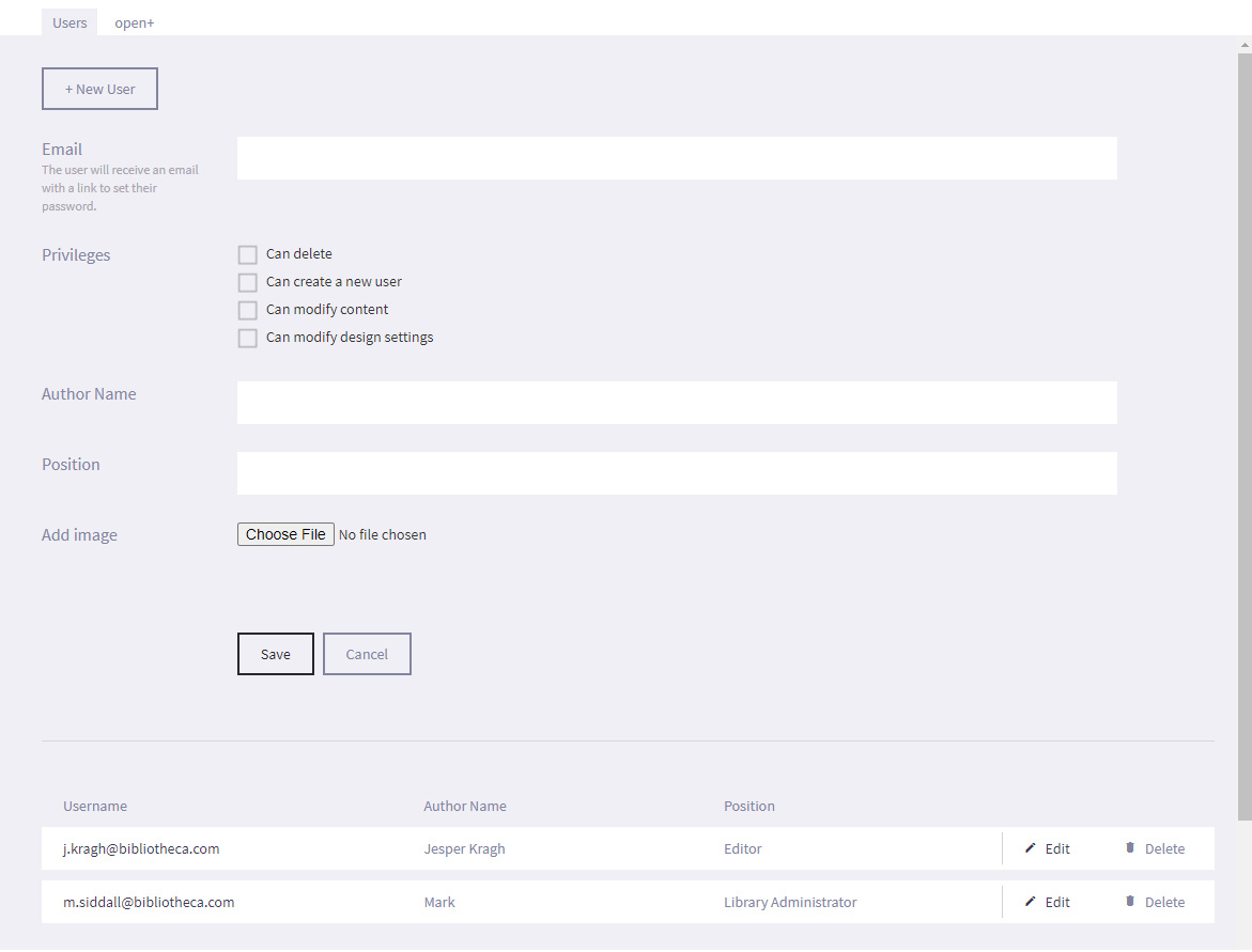
- Email - Edit the E-mail address that will be used as your user name. It is also the e-mail address that will be used to send notifications to, such as resetting your password.
- Priveleges - Set the permissions of the user on the uniFi+ Administration module.
- Can delete - Allows the user to delete users and content.
- Can create a new user - Allows the user to create new users for the admin module.
- Can modify content - Allows the user to edit content.
- Can modify design settings - Allows the user to modify design settings for the screen.
- Author Name - Edit the Author name of the user that can be associated to an article. This helps define who wrote or is responsible for each article and will be displayed on the article.
- Position - Edit the position of the user in the library.
- Picture - Choose an image to represent the author. This will be displayed on the article if an author is defined.
- Select Save.
-
12.1.1
-
12.2
Open+
You can configure which collections are displayed on the screen depending on the open+™ state of the library (staffed, unstaffed and closed).
For example, during unstaffed hours, you may wish to focus on essential and practical information that would normally be covered by staff, including "point and direct" questions that can now be covered by the Wayfinding widget. To set which collections are displayed during an open+™ state:
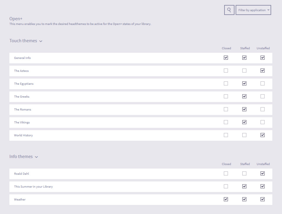
- Log in to the uniFi+ Administration module,
- Select Settings from the options on the Main menu

- Go to the Open+ tap
- Under the relevant header (Touch collections or Info collections), place a tick in the required checkboxes next to the collection to specify when the collection will be displayed. You can select a collection to be displayed in both staffed and unstaffed open+™ modes,
- You can choose to display collections when the library is closed. bibliotheca only recommend setting this option for display collections (that do not require additional physical interaction), on screens that can be viewed from the outside of the library, and only on screens that are not automatically shutdown by open+™.
- Changes are saved automatically.
- You can preview what each screen will look like in each state by selecting the Monitor icon in the Preview column
-
12.1
-
13.
Statistics
Selecting Statistics will display statistical data about the usage of your devices. You can specify the device and time period that you wish to view data for.
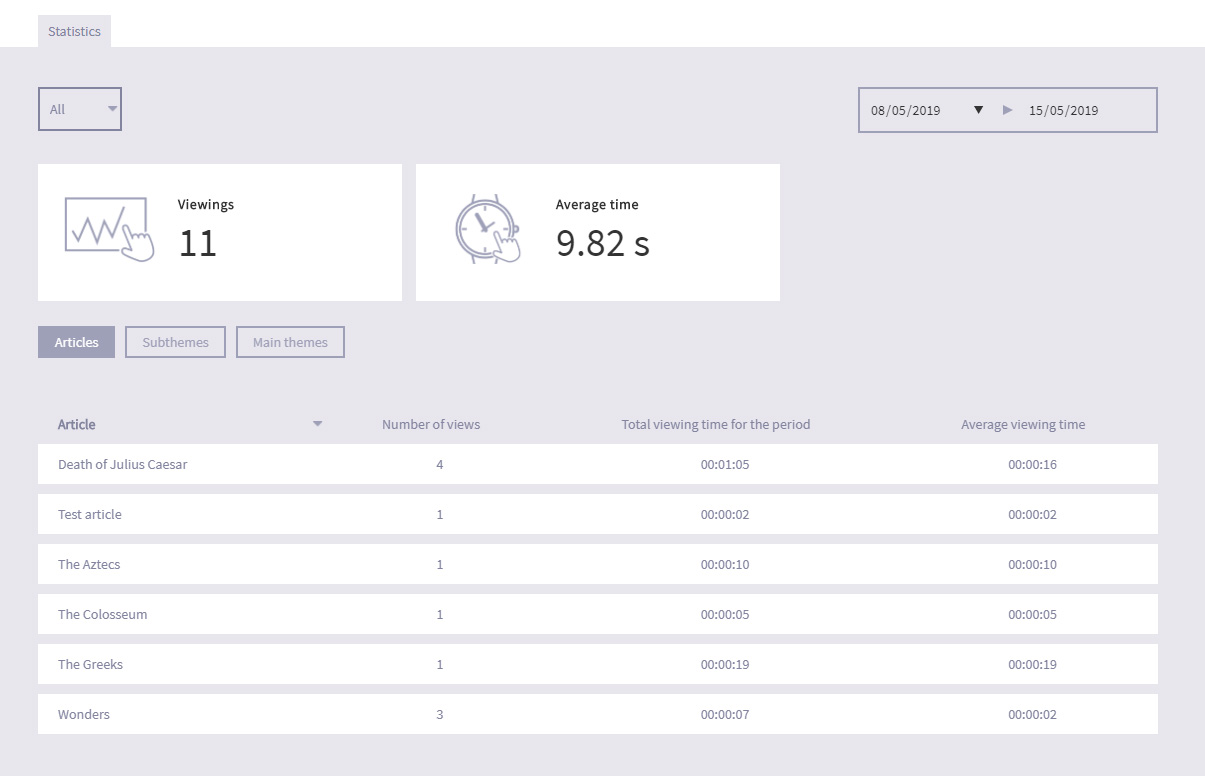
Not only can you see the number of viewings and average viewing time for the device (or all devices), but you can also choose to view information on specific articles, presentations/widgets and collections.
Using the data, you will be able to work out how popular specific content is and modify or promote it accordingly, in line with your patron's interaction.
-
14.
Appendix
This section contains good-to-know information about the uniFi+ system.
-
14.1
Media files
The following section details some of the requirements for Media Files to be used on articles and presentations.
-
14.1.1
Video
- Supported video format is .mp4 (H.264)
- Does not support these video formats: .wmv, .mpg or .avi, flv or f4v
- Recommended video resolutions: FullHD 1080 (1920x1080), HD 720 (1280x720p) or SD - PAL (720x576p), NTSC (720x480)
- Try using video-files compressed to a smaller file size to improve performance. Make sure you do not compress videos too much however, as this can greatly reduce the quality of the video files.
-
14.1.2
Images
- Supported image formats are JPEG (.jpg), PNG (.png) and SWG (.swg) files.
- Photos should maintain an aspect ratio of between 16:9 (landscape) and 9:16 (portrait) to fit in the various imageframes of the uniFi+ screen types. Images larger than the screen will be rescaled to fit.
- On uniFi+display / +idles different actions are taken on images out of format. Collection article images pan. Book covers zoom. Fullscreen images resize to fit. To make your +display / +idle images match perfectly, see content area sizes of +display and +idles below.
- “Map” images can have any aspect ratio (within reason). They just become scrollable.
- “Map” images can be up to 16 Mega pixels in size (4096x4096 pixels if image is square), but an image width of between 2500 and 3500 pixels will improve performance.
- Re-size formats (expect all photos to be resized into these formats):
- Original size.
- Media browser size (for fullscreen view on a HD screen).
- Thumbnail size (For the smaller images below the primary image in an “Article”).
- The text-field labelled “notes” is never used in presentations, but when you search for a specific photo in the Administration, the notes become searchable and can contain keywords and dates to assist with your search.
-
14.1.3
Audio
- Supported audio formats are: MP3 (.mp3)
-
14.1.1
-
14.2
Content area sizes of +display and +idle
Sometimes you may want to create media-content that fits the content area exactly to avoid cropping, resizing or panning animations.
The far most of +display screens today are in full HD resolution (1920x1080 pixels), but the size and format of the main content area depends on widgets, theme title bars and touch-advice chosen for the actual application.
Below are the content area measures of HD screens in most setups (click images to enlarge):
-
14.2.1
HD screens (landscape)
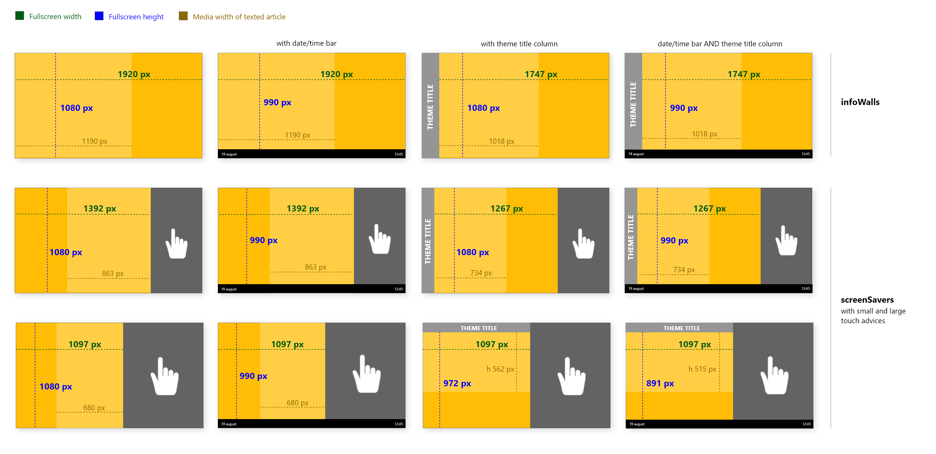
-
14.2.2
HD screens (portrait)
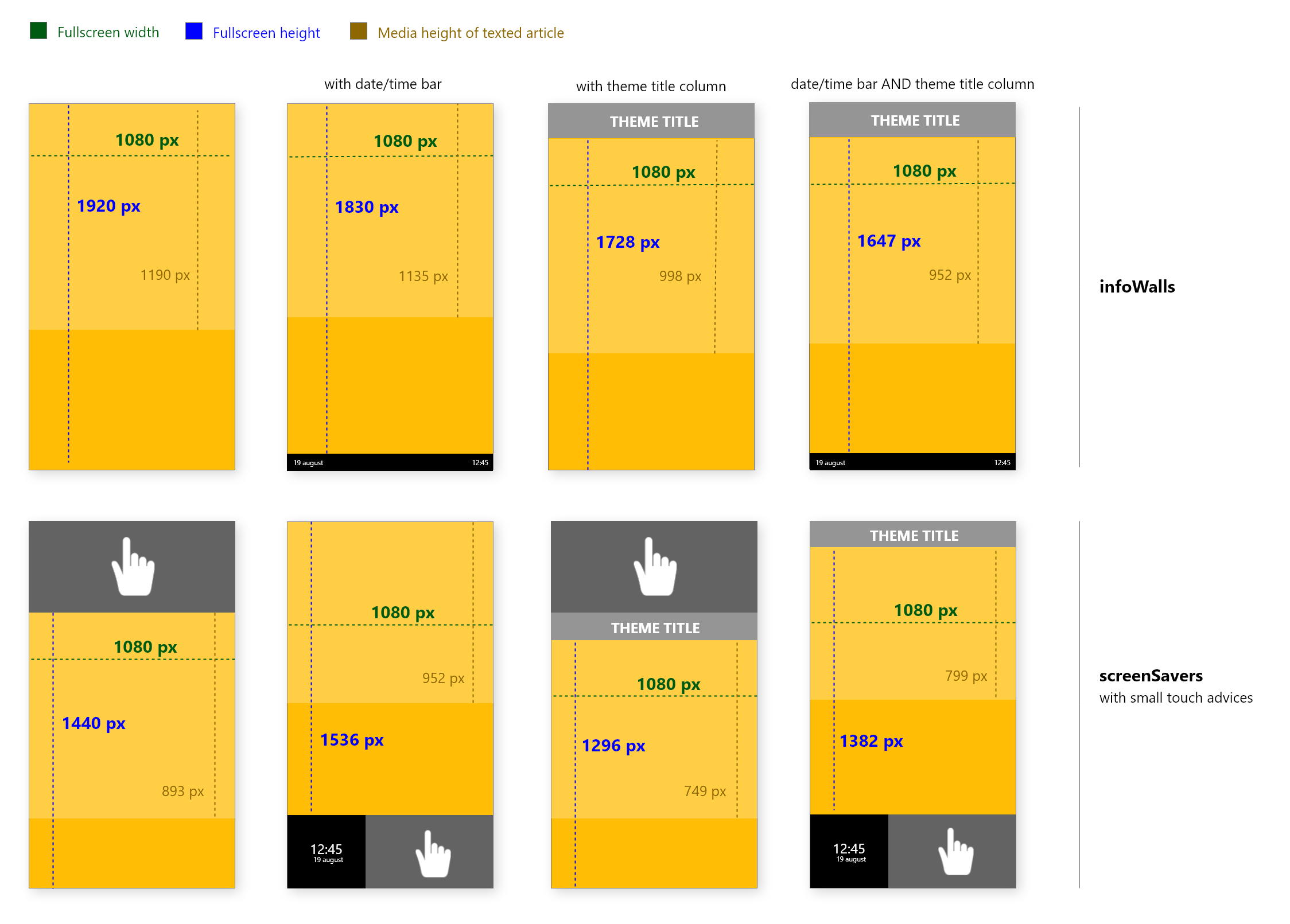
-
14.2.1
-
14.1
-
15.
Tips and tricks
-
15.1
Export images from PDF-documents
Sometimes you need to transfer content from a PDF-document to uniFi+-content. While text is easy to copy/paste, images can be a little tricky to export from the PDF.
- In your PDF-document, click on the image (once) to highlight it (The image gets a blue overlay).
- Right-click the image and choose "Save Image As..."
- In the dialog box, choose where to save the image and click "Save".
- Now the image is ready to use in any uniFi+-article.
Note: Images in PDF-documents are usually compressed in both size and quality. Therefore it is always recommend to find and use the original image if possible.
-
15.2
Export images from PowerPoint
When you want to use an image from a PowerPoint document, here is how to export it.
- Right-click the image you want to export, and click "Save as Picture...".
- In the dialog box choose where you want to save your image, and click "Save".
- You are ready to use the image in a uniFi+-article.
Note: If the document is locked, you want to enable editing. Double-click anywhere in the document and click on the "Enable editing" in the yellow bar just below the toolbox.
-
15.1